Home Page › Forums › Fiction Writing › General Writing Discussions › Cover Art Sharing Space/Critique
Tagged: Art, Cover Art, critique, encouragement
- This topic has 55 replies, 11 voices, and was last updated 4 years, 2 months ago by
 Abigail.M..
-
AuthorPosts
-
December 19, 2021 at 10:48 pm #107916
Hi Everyone! I’ve been making some rough sketches of my first two book covers, which I thought I’d share and hear whether you thought they looked good or not, and I thought maybe you guys would like to share your covers too, if you have them! It could be fun!
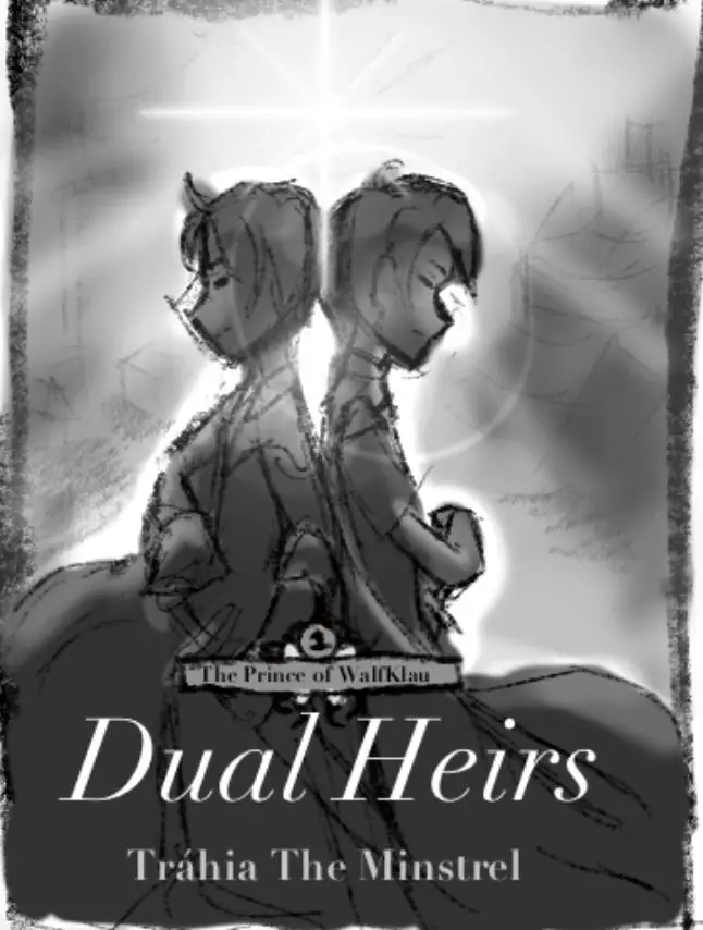
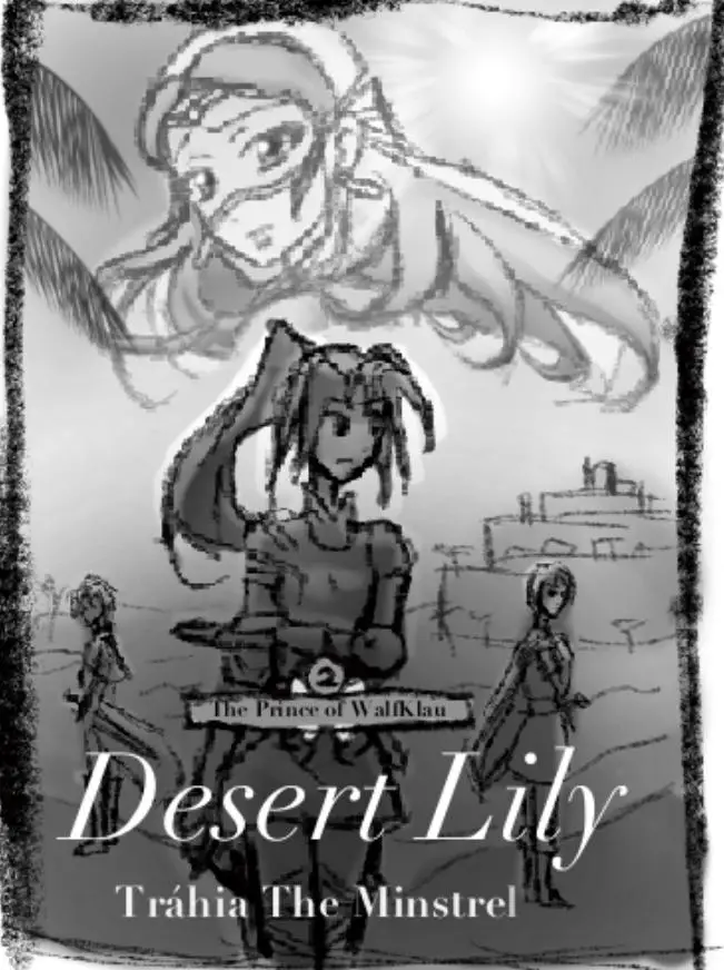
Book 1 and Book 2.
So I’ll go ahead and tag a bunch of people:
@jodi-maile @kathleenramm @keilah-h @issawriter7 @writerlexi1218 @not-so-secret-secret-assassin @power @annabelle @elfwing @godlyfantasy12 @lydia-s @joycaroline @daisytorres @elanor @scripter-of-kingdoms @abigail-m @koshka @elishavet-pidyon @seeker-of-the-truth @e-k-seaver @anyone-I-forgot-or-spelled-wrongThe end of a story, a beautiful picture; a feeling of longing yet hope~
That’s my wish to create.December 19, 2021 at 11:20 pm #107945Wow, Trahia! I love these, especially the second one. I love the two girls in the center of the cover. The hairstyle, clothes, and expressions show a lot about them. Who is the girl on the top of the cover? She looks like a very intriguing character and makes me wonder what she’s so worried over. I really like her design. Even the drawing style is really nice. I think these are awesome! 😀
December 20, 2021 at 1:55 am #107946Good layout. I would move the Prince of Walfklau scroll up to the top of the page (if that could be done without blocking any of the cover details. Then again, I don’t know.) Otherwise I think those look great! The sense of distance and plains is right as far as I can tell. I like the depth, with your angles lining up. Um, sorry, math teacher’s daughter… =]
I have done a light sketch for one of my book covers, but I haven’t got my sketchpad with me right now and it isn’t half finished. Even for a rough draft. All my art is by hand so it can be difficult to keep up with.
Anyway, I like your covers!
A cup of tea is cheaper than therapy.
December 20, 2021 at 2:47 am #107948Wow! Those are amazing. The layout is intriguing, and I think it’s awesome that you’re doing your own cover art! I want to do mine as well, but first I have to sort out my plot. (And settle on what layout, media, even characters to use) 😉
Anyway, those are astounding. Also, for a rough sketch, the top girl in the second cover is very well done. I like her attire and attitude, it creates a whole personality in itself. I also like the boys’ stance in the first cover. Overall, great job!
You have listened to fears, child. Come, let me breathe on you... Are you brave again? -Aslan
December 20, 2021 at 3:37 am #107949Thank you so much! The girl on the top of the cover is Princess Lína Veh-Jûranal of Férījinar, Lily of the Oasis. As to what she’s worried about … that’ll have to remain a secret, until my 2nd book is finished ??.
Yeah … I wanted to have ‘The Prince of WalfKlau’ at the top, and originally I did, but then I realised that it would obscure the art on the second cover. Which is why I moved it down to the bottom. I think it’d look better on an actual book, where it would be bigger and clearer — and the colours would contrast with the ones behind.
Thanks for your kind comments! I can tell you know a bit about drawing and/or math. Depth is a big part of making things look good and/or dramatic, and I did a one-week art workshop this year with a teacher — a professional concept artist and concept designer — who taught me a lot about depth. That was a fun course!
That’s so cool, that you’re sketching one of your covers! If you ever finish it, even the rough, I’d love to see it. It’d be really cool to see how you envision your cover.?
That’s cool you’re doing your cover art too! I’ll look forward to seeing it. Especially on your Iertan book.?? I just feel you and I have bonded over that one … is that also the one where you have a character called S??
Thanks! I did sorta go beyond a truly rough sketch with the girl on the top of the second cover.?? I just couldn’t help myself — mostly cause it’s an image I’ve had in my head for ages … (I really wanna do a whole animated trailer/anime op where she turns in that pose, but so far I’ve discovered animation takes a ridiculous amount of time and effort. ??? )
Yeah, I always enjoy the classic back-to-back kind of stance. It just looks cool, to me. Anyway, thanks so much for the comments!
The end of a story, a beautiful picture; a feeling of longing yet hope~
That’s my wish to create.December 20, 2021 at 11:22 am #107951That makes sense. I think it will too, once everything’s filled out.
That would be a fun workshop! I know it takes a lot of work to get all that right in any type if art. But it’s so rewarding…
I’ll have to put it on here as soon as it’s done. Thank you for sharing yours!
A cup of tea is cheaper than therapy.
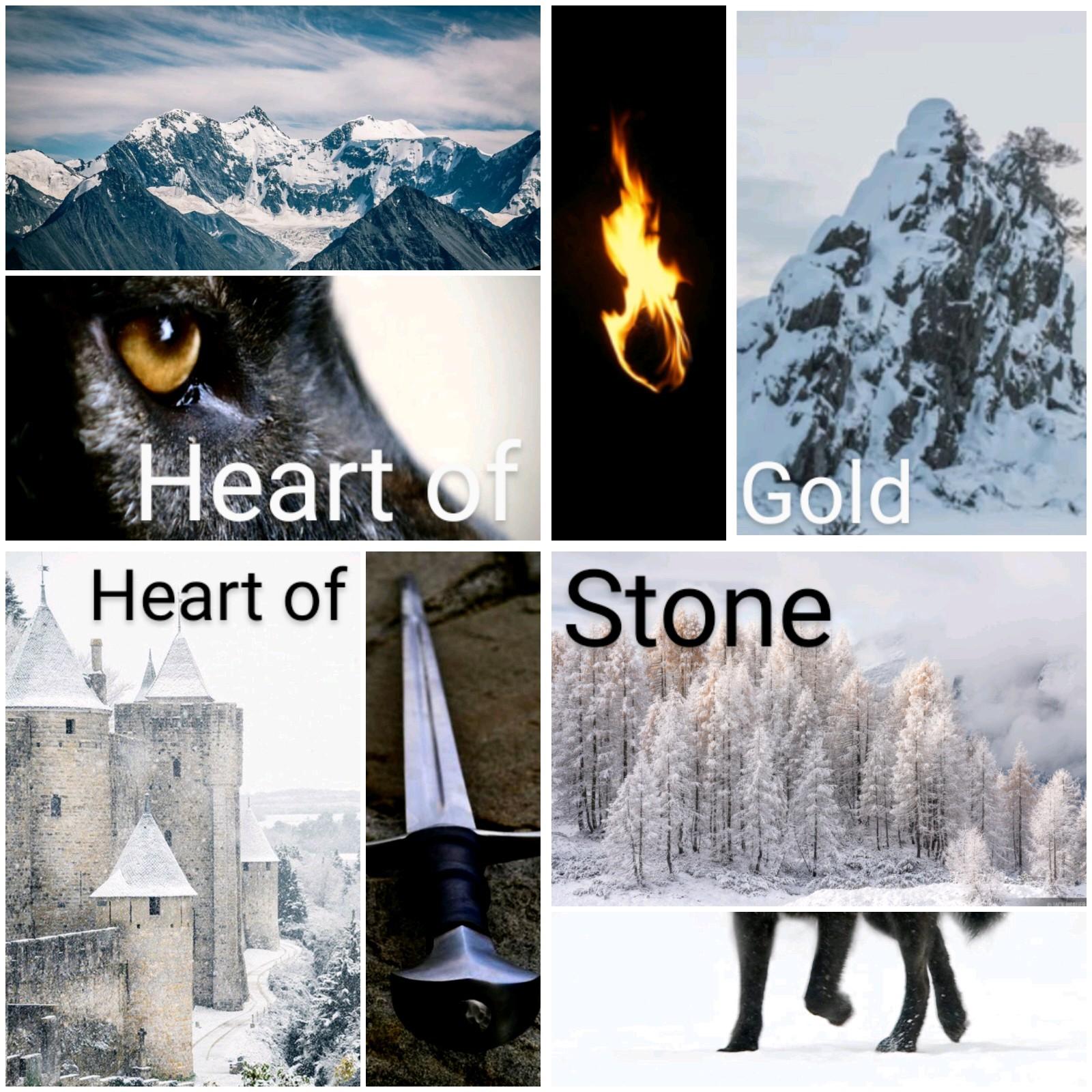
December 20, 2021 at 11:37 am #107953Here is a collage I made for HOGHOS (wow, that acronym is awful). It isn’t at all like my cover idea, but it has a similar feel.
A cup of tea is cheaper than therapy.
December 20, 2021 at 3:29 pm #107955I really love your cover art! I hope we’ll get to see it once it’s polished. Are you doing a duology?
Your collage looks great!
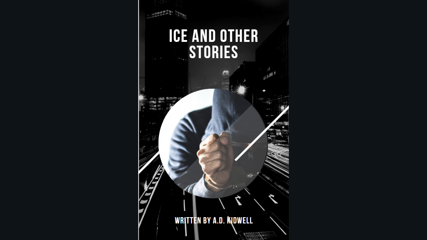
I’ve been toying around with cover ideas for my WIP on Canva as well.
We crazy people are the normal ones.
December 20, 2021 at 3:49 pm #107957And here’s my other idea (i made this one first, I’m not sure which aesthetic matches best with the story)
We crazy people are the normal ones.
December 20, 2021 at 4:13 pm #107959I love your collage! It’s definitely got me intrigued about your story.?
Yes, art that you can feel satisfied with is sooo rewarding…
I love the second one you put up (which you said you’d done first), but since I don’t know your story, I can’t say whether the darker and more ominous aesthetic of the first one (the one with the sweatshirt dude) — which makes it feel like a thriller — is better. Also, is that your pen name on those books?
And no, my series isn’t a duology. It’s 5 books, I think, I just haven’t finished and/or started the cover mock-ups for the other 3 yet.?
Thanks for the comments!
-
This reply was modified 4 years, 4 months ago by
 Trahia the Minstrel.
The end of a story, a beautiful picture; a feeling of longing yet hope~
That’s my wish to create.December 20, 2021 at 5:07 pm #107954Wow, both of those are so good! I love the style! I already want to read your book just by looking at the cover. I like the expressions on the faces of the characters. It makes it look way more interesting. The titles are great too. That’s all the feedback I have. I think just add some color to those pictures, and they’re ready.
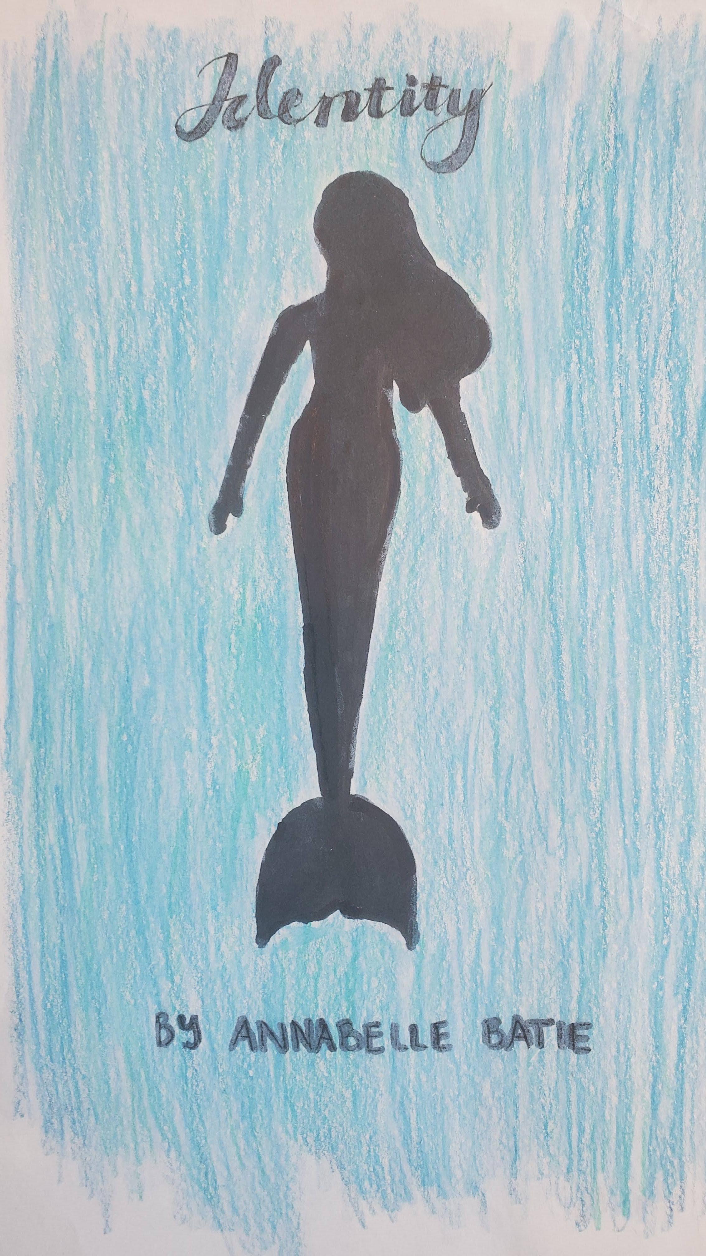
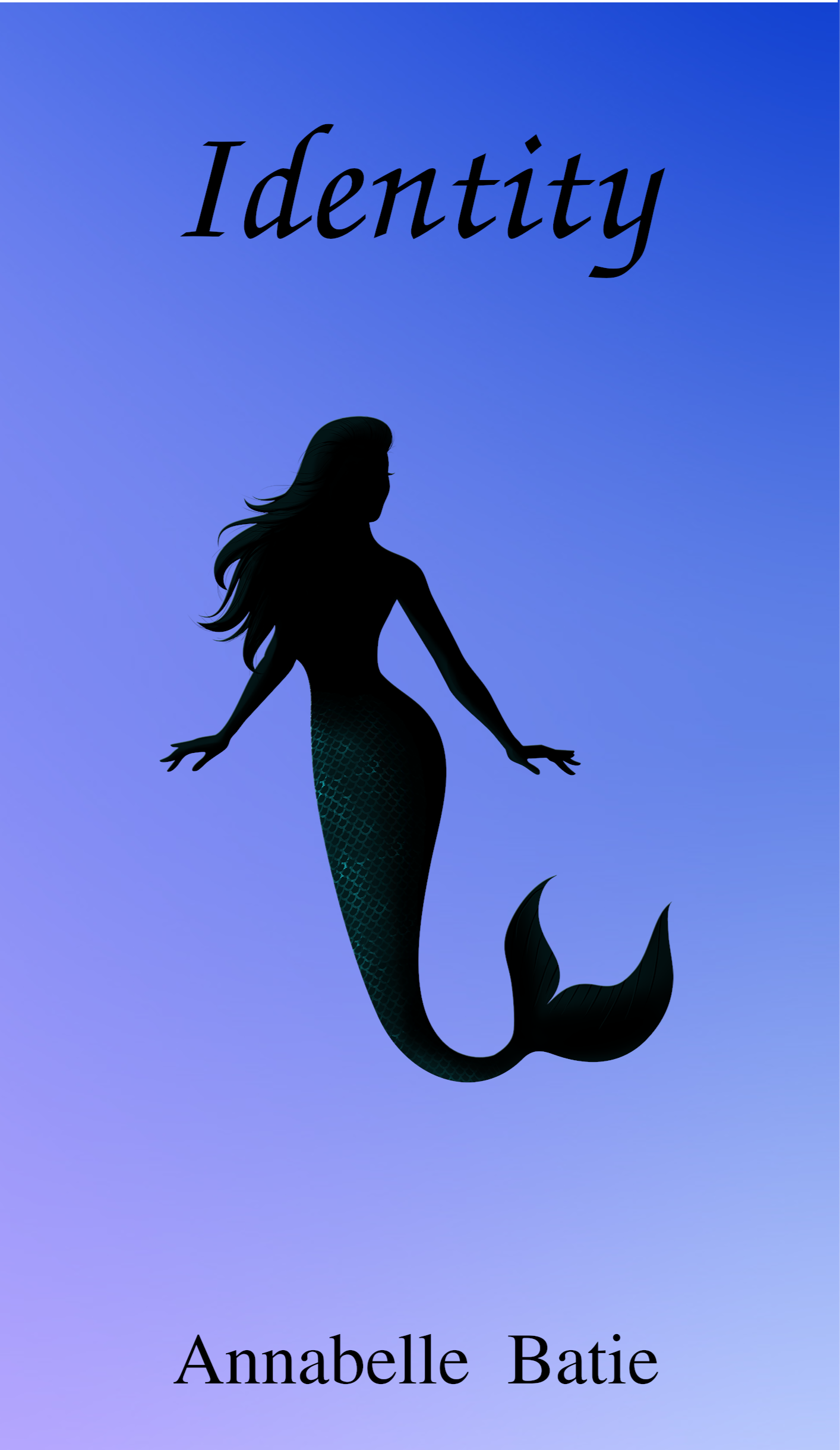
Here are my two cover drafts, although neither of them is anything compared to yours. I used colored pencils, so they’re pretty rough.
Cover #1:
Cover #2
Cover #2 Created Digitally:
In the words of Jinto Queb, "Hurry, reading is fun!"
December 20, 2021 at 6:08 pm #107968Thanks!
I love your compositions — it really evokes this feeling of wistfulness, or determination — the mood tells a story. I love the last one, and I think it’s cool you work in coloured pencils! I’ve done a lot of coloured pencils drawings before. Good job!
The end of a story, a beautiful picture; a feeling of longing yet hope~
That’s my wish to create.December 20, 2021 at 6:20 pm #107969Thanks!
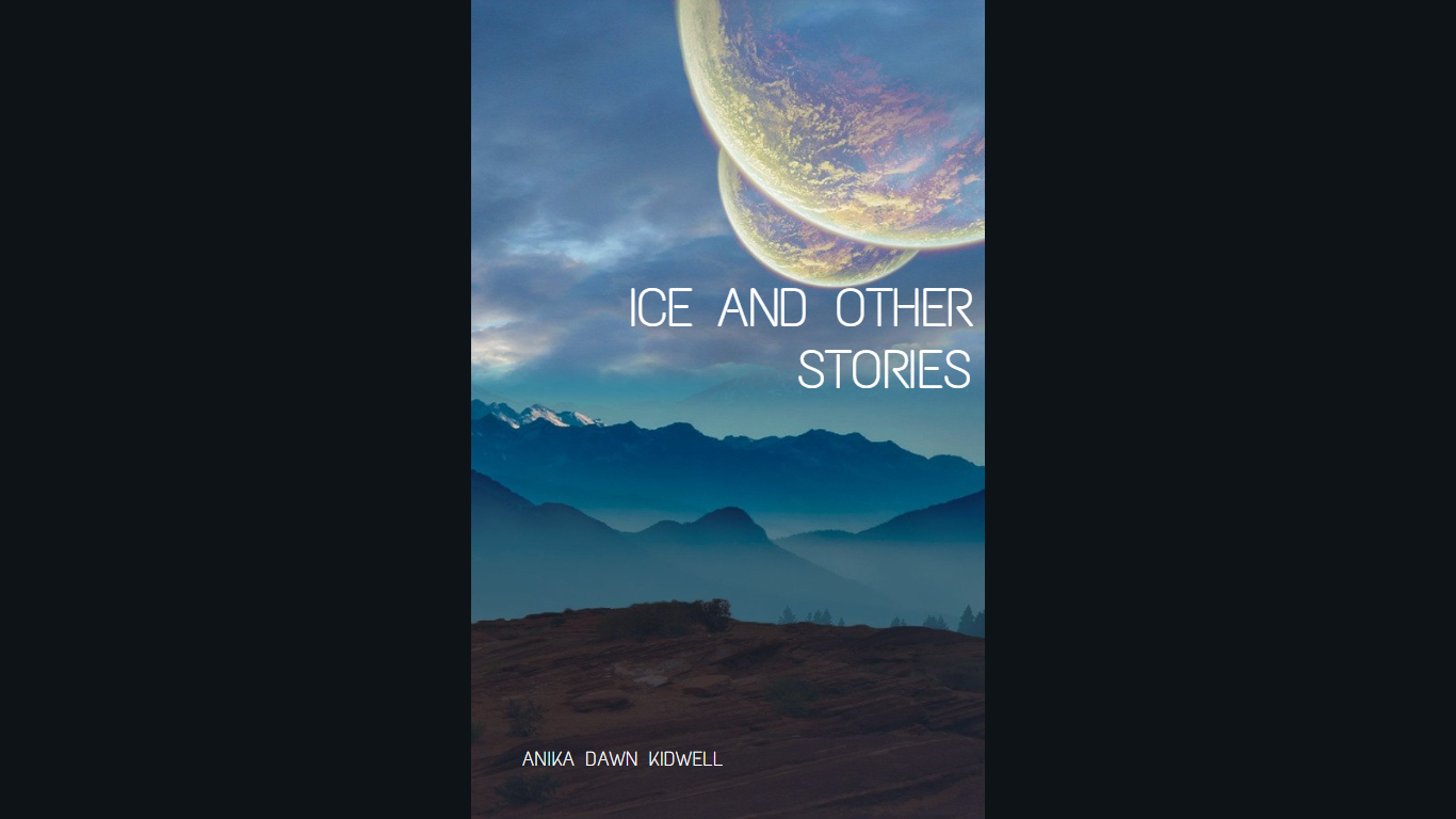
The colors in the second seem to fit with the word Ice, but so does the first in a darker way. The first might have better placement for English speakers. (Our eyes tend to start at the top left corner of a page). What is the general theme of your book, if it doesn’t spoil anything?
Good, that’s what I intended it to do. It was originally compiled to keep up my sense of this story.
I don’t know a whole lot about cover art, but the simplicity of the last two is making me think of leather bound books.
Weird random question: do you use any type of blender when working with pencils?
-
This reply was modified 4 years, 4 months ago by
 Koshka. Reason: Vague pronoun
A cup of tea is cheaper than therapy.
December 20, 2021 at 6:21 pm #107970I’m glad you like them! I definitely have some more work to do, but it’s a start.
In the words of Jinto Queb, "Hurry, reading is fun!"
December 20, 2021 at 6:25 pm #107972Wow! You spent a lot of time drawing those. Good job! The second one in particular is well done. The human eye tends to like threes.
I would recommend having your characters in the second cover that are wearing armor to also wear helmets (or at least hold helmets). The helmet isn’t used very often in movies or pictures because it can block the view of the hero’s/heroine’s face, but it is thought to be the most important piece of armor. A soldier can survive a blow to the torso or limbs, but a blow to the head usually ends him/her.
-
This reply was modified 4 years, 4 months ago by
-
AuthorPosts
- You must be logged in to reply to this topic.
