Home Page › Forums › Other Art Forms › Art › Book Cover Opinions #2
- This topic has 96 replies, 14 voices, and was last updated 9 years, 5 months ago by
 Rolena Hatfield.
-
AuthorPosts
-
December 31, 2016 at 6:42 pm #23532
@his-instrument Ok, I’m back to give you my rant on self-publishing and marketing.
So, I love the self-publishing. Maybe I’ll change my mind when I’ve tried it, but I don’t think so. You have full control and full rights. Check. You get way more royalties. Check (publishers keep the vast majority of the profit, and in many cases, they don’t even do very much marketing.) Full control of your book can also make marketing easier. The only thing is you need to be able to market it well.
There are a lot of different options, methods, and considerations that complicate book marketing, but at it’s core, it’s actually super simple. It works like this.
> You publish your book.
> You get as many people notice that your book exists as possible
> You get as many of those people who know your book exists to check it out as possible
> You convert as many of those people into buyers as possible
> You please your readers with a seriously good story.
> You get as many of those pleased readers as possible to share the story with others by making it easy and/or profitable for them to do so.
> You try to keep in contact with as many of those pleased readers as possible so you can sell them your next book. (This can include getting them to follow you on social media or your blog, but the best thing is to get them on an email list)
> You try to please your followers, connect with them, and make sure they don’t entirely forget you exist.
> Rinse and repeatThat’s literally all there is to it.
I should add a few details about the third and fourth steps though. Conversions (step four) are all important. It’s what makes all your efforts to drive traffic worthwhile. The higher your conversion rate as well, the more time and money you can afford to spend on driving traffic. It’s a good upward cycle. There are several elements to this. A cover is very important, because that is what people judge a book by. The main thing at this point is that it looks professional and interesting. A cover by itself doesn’t really sell a book, it just makes people interested. The other thing is the description. Descriptions will sell a book if they draw in people’s emotions and it sounds like the type of story they like. The more reviews and the more positive reviews a book has also increases its conversion rate. The other thing is the preview (I forget what it’s official name is.) Basically, people on Amazon (there are other markets of course, but this is the one people tend to like the most) can download the first 10% of your book free, so making that first 10% gripping will attract a lot of buyers. Also, if a book has accolades, that can increase conversions.
Now, traffic (point #3. Well, actually it’s a combination of point 2 and three, because some traffic will lead directly to your book page, whereas some traffic could just be on a retailer website, book blog, etc where people then have to click to see your book page). These steps are a lot more complex. I’ll just discuss the main traffic options.
.People you know. Duh.
.You can get reviewed on a book blog which could get a lot of readers to see your book.
.You could get a blog on some niche your book relates to feature you. (i.e. a pioneer history blog if you wrote a pioneer era historical fiction piece)
.You can get interviewed on podcasts about books or a niche your book relates to. (All these “get featured on other people’s sites and podcasts stuff is not guaranteed. They want stuff to talk about though, so if you sound particularly interesting, you have a good chance.”)
.You can do cross promotions. That means you and other authors promote each other’s books. This could be for a short time event, usually with a sale. This could also be a long term thing where you basically ally yourself with another author and promote each other as much as possible. The principle here is that by joining your audiences, you will both sell more books.
.You can do ads. A high conversion rate is especially important here. There are all sorts of different ads. There are sites you can pay to promote your book — ones that have an email base of readers. There are google ads. There are social media ads. There are amazon ads. Some of these can earn you more than you spend on them right up front, but generally you’re losing money for a short period of time. The payoff though is that the increased sales moves you up in the online algorithms (more on that below) which means more people see your book and hopefully buy it — which could end up making you a profit. (I do know of one guy though that has a course on how to convert amazon ads consistently at like 300%.) The other way you can use ads is to get people on your email list. (I should really talk a bit about email lists, but maybe later.) The basic idea though is that you can set it up so that ads will send people to go subscribe for your email list. These, then, could convert into buyers, so there is a good chance at profit. The important factor in this is that you have to earn a good amount from your average subscriber. The more books and other products or services you can sell to your subscribers, the higher that statistic will be. The higher your average profit per subscriber, the more you can afford to spend on ads.
.You can get the online retailers to show your book to people by understanding their algorithms. Basically, Amazon, B&N, Ibooks, and other sites examine certain data about your book and decide how they should rank your book and where they should show it. I really can’t go into all this now, but basically there are ways you can make those retailers place more value on your book so it will be seen by a lot more people. It’s not that hard to understand, there’s just a lot of details.Ok, I need to go eat dinner now.
??????????????????????
December 31, 2016 at 8:39 pm #23537@Daeus I literally just copied and pasted that into a word file… 😀
December 31, 2016 at 8:42 pm #23538@kate-flournoy You stole! I’m so happy. You’re catching on.
??????????????????????
December 31, 2016 at 8:43 pm #23539Ha! Oh dear…
January 1, 2017 at 4:38 pm #23576@daeus Thanks so much! Make sure to keep me posted on how all this goes for you. I’ve spoken with people who have done publishing before and they’ve said that small publishing houses aren’t as bad as they sound, so I may try that and let you know how that works for me. Regardless it will require me to do my own marketing, so thank you for the tips on that.
YA Fantasy Writer
Obsessive Character Namer
Find me at hisinstrumentblog.wordpress.comJanuary 12, 2017 at 6:33 pm #24347@kate-flournoy @emma-flournoy @mark-kamabaya @jess @hope @his-instrument @dragon-snapper @anyone-else.
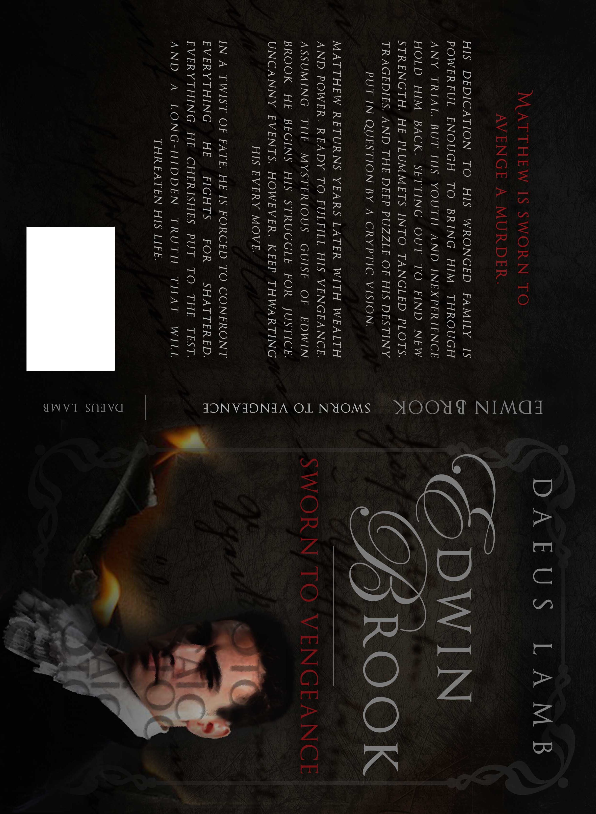
Hey, y’all. I’m back with another cover here. I think my designer either misunderstood me or missed some of my changes, so it’s a bit different than what I was planning, but it ended up being pretty cool in my opinion. I get the feel that it’s cleaner and more professional and it has a more historical and actiony feel, which is what I want. The only thing I’m not so sure about is the font. I feel like it’s too cramped all up there at the top. What I’d really like to do is see if it’s possible to fit my name down at the bottom and move the title up a bit. Oh, by the way, the subtitle’s changing, but it will be about the same length.
So any of your thoughts are appreciated. Here it is:
??????????????????????
January 12, 2017 at 6:58 pm #24348@Daeus heyyyy, I actually really like that. There’s a lot more for the brain to process there; it’s vastly more interesting. The only thing I can think might help with setting the genre a bit more obviously is a sword somewhere in the design… it doesn’t have to be in the actual picture, but maybe in the border… just a sword-shape. You could even use it to underline the title if you wanted to.
And speaking of the title, I do like it? But the capitals of that font are overdone. I would suggest something less crowded.
How many revisions do you get by the way? I assume there are only so many times you’re allowed to change it… that’s the standard practice. 😛 To guard against perfectionist nitpickers *cough* @Hope *cough* I guess, though I think that’s a little silly… after all, if you’re hiring yourself out to do something for anyone, you should always do it to their satisfaction. *sniffs**dusts self off primly* At least such is my opinion. XDBut I like it. Vast improvement.
January 12, 2017 at 7:27 pm #24351@Daeus I really like this. 🙂 It makes me want to read it. I think having your name at the bottom would be better. Compared to your last drafts this is really fantastic. I especially like the writing in the background, which gives it that perfect mysterious and historical feel. I can’t wait to see the final version.
Theater kid. Currently depressed because I can't stop listening to sad musicals.
January 12, 2017 at 7:27 pm #24352I like it. I love how the words flow. And thank you, @kate-flournoy. I shall give you a glowing recommendation whenever you need it. 😉
INTJ - Inhumane. No-feelings. Terrible. Judgment and doom on everyone.
January 12, 2017 at 7:29 pm #24353@kate-flournoy Thanks for the input. Do you think the capitals are just too big, or do you think they are too fancy — or both. Also, do you agree that the font seems to come down too close to his head?
I get unlimited revisions, but there’s a time limit. I think it’s normally about a week you have, but it’s been a bit different for me. My designer started late cause she was sick, then she had a baby, then she started late cause she had catchup work to do. They’ve extended it to fit for the interruptions.
??????????????????????
January 12, 2017 at 7:33 pm #24354January 12, 2017 at 7:53 pm #24356Never mind. I will leave you in @kate-flournoy’s capable hands.
INTJ - Inhumane. No-feelings. Terrible. Judgment and doom on everyone.
January 12, 2017 at 7:59 pm #24358*screams* @Hope you deserted me!
Oh wait, I can do this. Yeah. I’m fine. 😉
January 12, 2017 at 8:00 pm #24359So here’s a question, I showed the cover to my mom and she got quite a different impression than I did. I felt like it gave the story a more historical action feel, whereas she thought it gave the cover a cheap murder story feel. She also thought the guy was holding some sort of sword or gun in his hand (that’s what she mistook the flames licking up the paper for.)
So do any of you have any input?
Now, one thing I do think might be changed is the the guy’s appearance. Not overall, but I kinda feel he seems a little less mysterious than in the previous version and a little more dark. I had said something about this before and I think my designer would be able to tweak his expression slightly. Do you think it would improve the cover if he were less stern?
??????????????????????
January 12, 2017 at 9:00 pm #24363@Daeus I think it could be a little less dark; the over all color. Edwin is supposed to look a tad shady though, isn’t he?
But the over all black impression does make it seem a little…modernish and murderish? It makes it look less like a Dickensy historical fiction to me, but that’s what I get the impression it’s supposed to be more like.
Maybe adding a sword or sumpin’ like Kate said would olden it up. 😛
Also, what Kate said about the first letters of the title—and I do think your name would look better at the bottom, with the title moved up. -
AuthorPosts


- You must be logged in to reply to this topic.