
Home Page › Forums › Fiction Writing › General Writing Discussions › Best Cover Designs
- This topic has 9 replies, 8 voices, and was last updated 8 years, 4 months ago by
 MNValentine.
-
AuthorPosts
-
February 22, 2018 at 5:10 pm #64466
So I’m not looking for cover design tips, I’ve already read the whole internet on that topic 🙂 But I want to hear what covers you all think are well designed – fiction, nonfiction, I really don’t care, I just want to know what you think looks good!!
@dekreel @that_writer_girl_99 @sam-kowal @daeus @valtmy @rochellaine @ashlyvye @dragon-snapper @anyoneelse 😀Silence! Silence everyone, for the king's speech!
February 22, 2018 at 5:29 pm #64468@mnvalentine I have two favorite types of covers, and they’re for two different types of books.
For realistic contemporary or historical fiction, I like a cover that’s simple, has one picture that doesn’t have a lot of mystery, but just is a plain eye-catching photograph or artwork, and then the title of the book in large print across the top. Something like this:
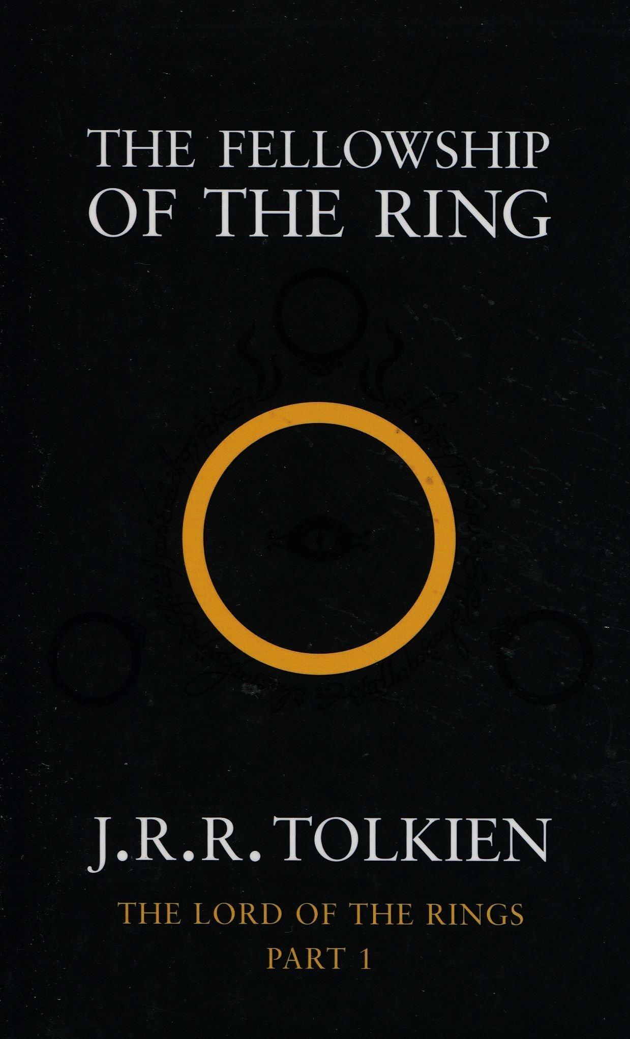
And then for fantastical or unrealistic fiction I like a mysterious, dark cover with the title scrolled or designed artistically, like this:
That’s not to say I don’t like other covers or that neither of these covers can be used for the opposite genre, but as a standard, these are my favorites. 😀
I hope this is what you were asking for…
"Sylvester - Sylvester!"
February 22, 2018 at 7:48 pm #64477@mnvalentine Distinctive artwork, that stands out and also connects with the story. always seems to make a great cover to me. Covers that sort of seem generic and rely on a lot of explosions/shiny lines to get your attention don’t seem memorable, for example:
The cover is cool, but not memorable. (An awesome book, though.)

Whereas:
That tells a story. That’s a piece of art.
*Giarstanornarak tries to melt chair*
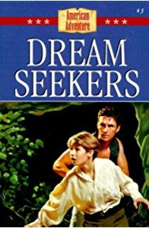
Also, Daeus has 22 turtles in his signature.February 23, 2018 at 8:46 am #64505Perhaps this is just me but I dislike covers that illustrate and give readers a clear idea of how the characters look (I want to be able to use my imagination and if I don’t think that the “beautiful heroine” or “handsome hero” shown on the cover is beautiful or handsome, that puts a damper on the whole reading experience).
Personally, I like book covers that are simple, distinctive and have some connection to the story. I think of it as giving a little hint or tease of the grand adventure waiting within.
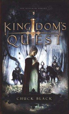
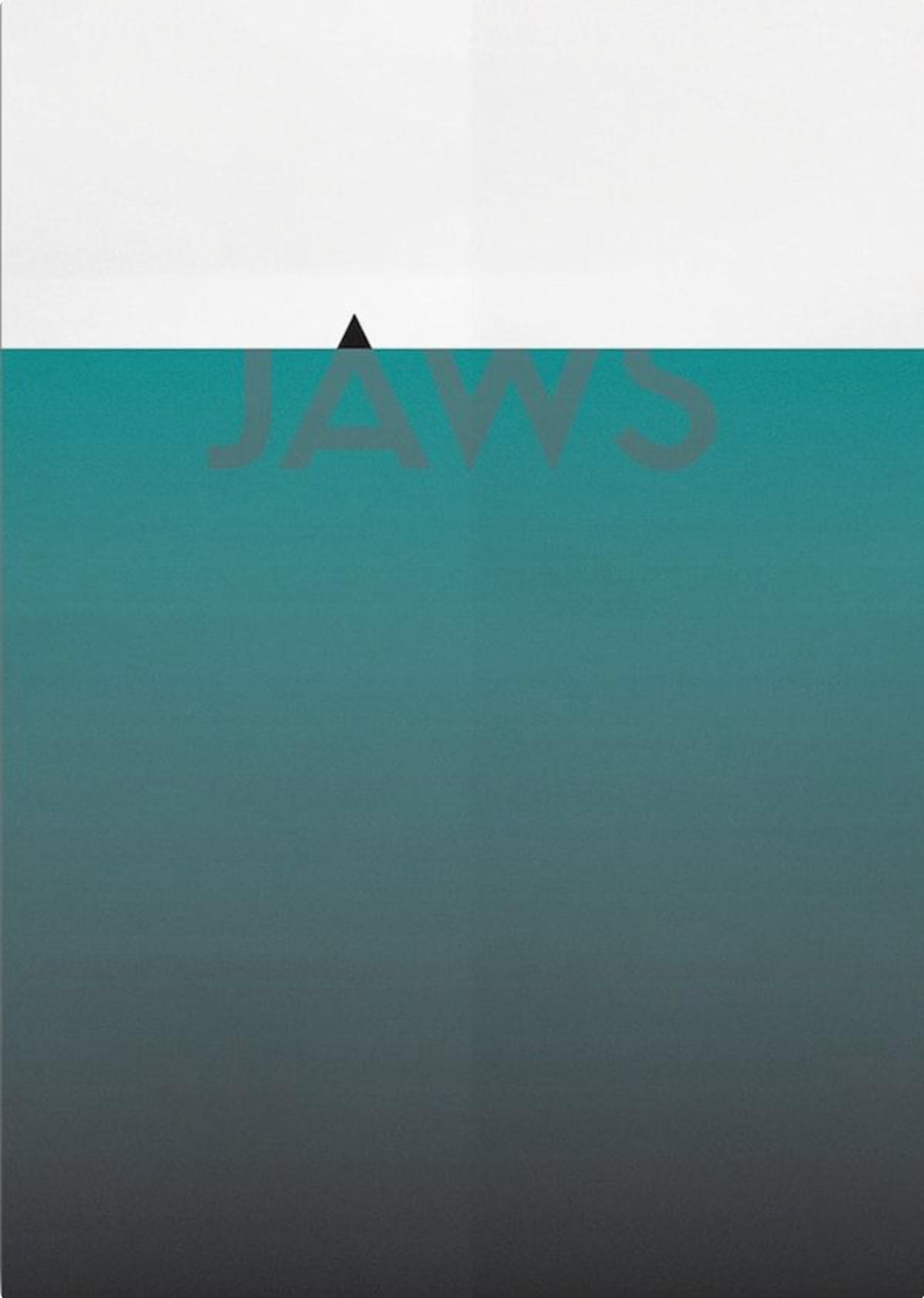
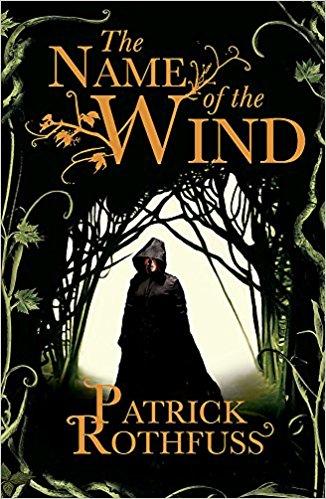
For example, I once spent several minutes at a bookstore just pondering whether or not to buy this because the cover attracted me amidst all the glimmer and generic artwork of the others:
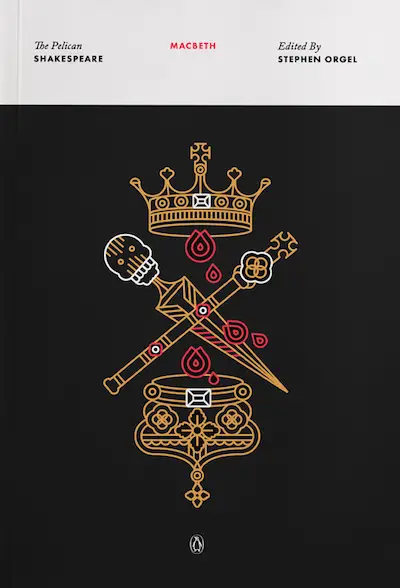
I find the drawings from The Pelican Shakespeare series beautiful as well:
Lastly, a picture says a thousand words. I really like it when a book cover manages to convey so much. Just looking at this one below is heartbreaking:
 February 23, 2018 at 10:17 am #64508
@mnvalentine I really don’t like covers that have the main character on them, because they never look the way I imagine them to. 🙂 I prefer simplistic covers that hint at a part of the story.
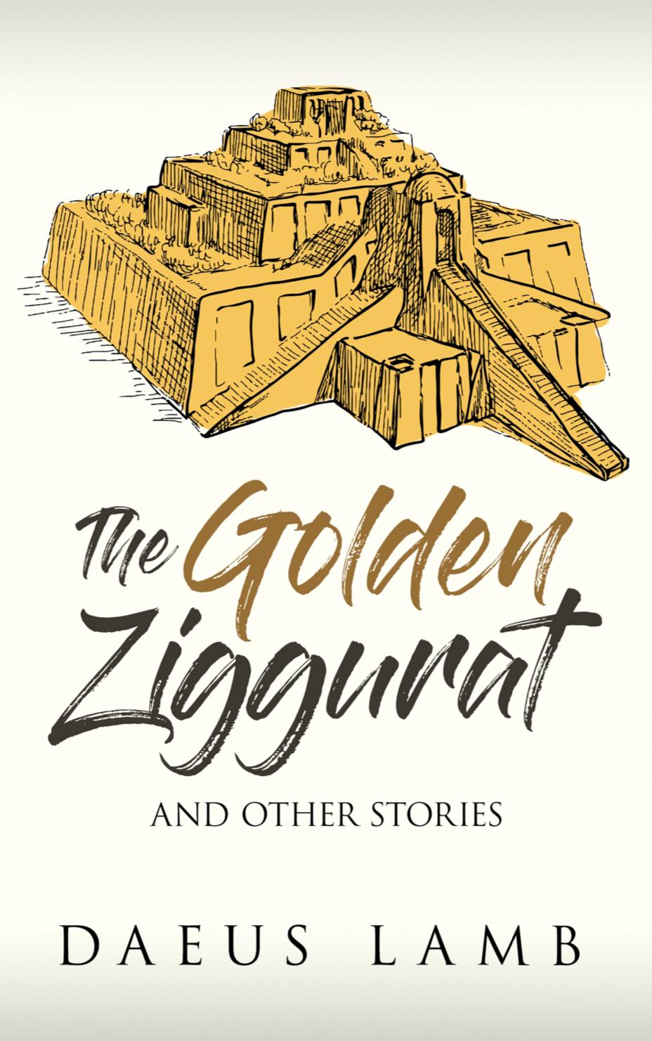
In my opinion, that’s a great cover. Also, @daeus ‘s Golden Ziggurat is especially good.
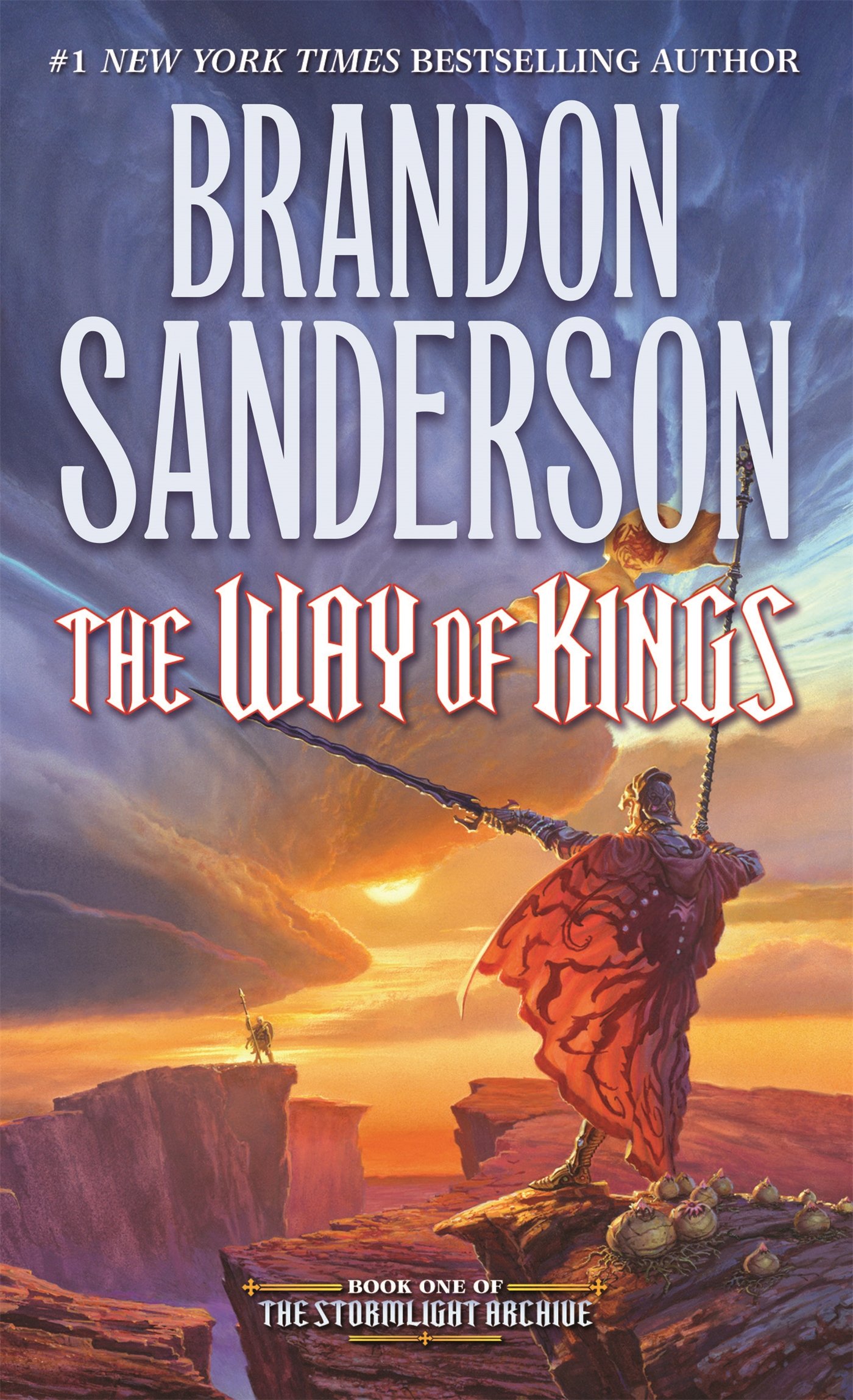
Something like The Way of Kings (see @sam-kowal ‘s post) would come in second for me.
A Kapeefer for life!
Compendium of KP Literature: kapeeferliterature.wordpress.comFebruary 23, 2018 at 10:49 am #64510Well, I had my idea before I started reading the other posts and realized Sam’s is by the same author as my favorite cover:

In this cover it’s actually showing a certain part in the story where Vin, the main character, is fighting big blue things *try’s desperately not to give away spoilers*
Mistborn has many (and I mean like 4 each) covers, so sorry I’m picking two from the same author and series but…
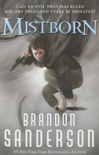
*sigh* The first book. I like this picture because it show’s the main character in action. Personally, when I look at a book I don’t want it to just be lines, circles and squares. I know Ben P. said they don’t like it when there are characters on the book cover, but if you’re very descriptive about the character, and perhaps put them on the cover of your first book then it wouldn’t mess with the image of the character like Ben suggested.
*insert awesome signature because I'm a bit too lazy to come up with one*
February 25, 2018 at 6:17 pm #64654@rochellaine @sam-kowal @valtmy @supermonkey42 @ashlyvye
Thanks for the input! Great advice!!! I’ve been struggling over the cover of my book for a long time, but I think I have it figured out now 🙂
Silence! Silence everyone, for the king's speech!
February 25, 2018 at 10:24 pm #64676February 25, 2018 at 10:41 pm #64680I love simplistic covers, like this one:
This is the cover for the edition that I own, and I really like how simple it is, but how pretty.
@sam-kowal this was the cover for the edition of Steelheart I read, and I think it’s super cool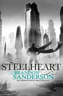
This one is nice too, simplistic, but mysterious and reflecting the feel of the book:
And finally, I love this cover too:
Basically, simple, eyecatching, and reflecting the type and feel of the story. I like to be able to tell exactly what genre it is, and get an idea for the premise, from looking at the cover.
INFP Queen of the Kingdom commander of an army of origami cranes and a sabre from Babylon.
February 26, 2018 at 10:40 am #64702@dekreel That one’s cool 🙂 I like the way the colors are used.
@seekjustice I really like that Lord of the Rings cover., I don’t think I’d seen that one before. I’m definitely one for simplistic covers too 😀Silence! Silence everyone, for the king's speech!
-
AuthorPosts

- You must be logged in to reply to this topic.