

@overcomer
Active 9 months, 3 weeks ago- Rank: Knight in Shining Armor
- Total Posts: 550
-

Kate Flournoy replied to the topic Book Cover Opinions #2 in the forum Art 9 years, 9 months ago
@Daeus here I am! Returned from the dead!
*dives into critic-mode* Okay, I like it? First problem is it doesn’t fit the genre. Not sure it quite looks like a romance, but it doesn’t really fit the story. Some of that may be because of the boring brick wall but you said that’s going, so… yeah. For an action/adventure though it’s too calm and…[Read more]
-

Mark Kamibaya replied to the topic Book Cover Opinions #2 in the forum Art 9 years, 9 months ago
I’m sorry, man. But it looks like a romance. Despite the title.
-
Mark Kamibaya replied to the topic Book Cover Opinions in the forum Art 9 years, 9 months ago
Overall it’s pretty cool. Here is what I noticed in order.
–That’s cool looking. A medieval guy in an 19th century setting.
–Wait, is this supposed to be a medieval guy in a medieval setting? It doesn’t seem like it. Oh well.
–Seems like a thriller. Although most thrillers have a back shot. Not a front shot.
–The guy looks very…[Read more] -

Ethryndal replied to the topic Book Cover Opinions #2 in the forum Art 9 years, 9 months ago
@daeus I had to scrutinize it very closely to figure out that he’s holding a cane. At first glance, it looks like some strange kind of shoe or something. Also, the red lettering doesn’t seem to stand out very well, though I would be careful if you brighten it, because you don’t want it to look like Santa Claus’s coat. I think the hand with the…[Read more]
-
Ethryndal replied to the topic Book Cover Opinions in the forum Art 9 years, 9 months ago
@daeus I think the picture is really neat, with the deep dramatic shadows, I just don’t like the title font too much. Like Emma said, it kind of seems plastic. I think maybe if it were a little more aged and worn looking, it might fit better. Also, I thought the design behind it almost looks like it’s part of the road, though I’m not really sure…[Read more]
-
Ethryndal replied to the topic Book Cover Opinions in the forum Art 9 years, 9 months ago
@daeus I think the picture is really neat, with the deep dramatic shadows, I just don’t like the title font too much. Like Emma said, it kind of seems plastic. I think maybe if it were a little more aged and worn looking, it might fit better. Also, I thought the design behind it almost looks like it’s part of the road.
-

Daeus replied to the topic Book Cover Opinions in the forum Art 9 years, 9 months ago
Ah, yes, I was thinking a redish-gold actually.
-
Daeus replied to the topic Book Cover Opinions #2 in the forum Art 9 years, 9 months ago
@hope Let’s hope the mice don’t eat her. Mice do that, you know.
You’re probably right about just having the hand. I’m thinking I’ll try for just a locket, thought perhaps the girl and/or just hand could be edited to work.
-
Daeus replied to the topic Book Cover Opinions #2 in the forum Art 9 years, 9 months ago
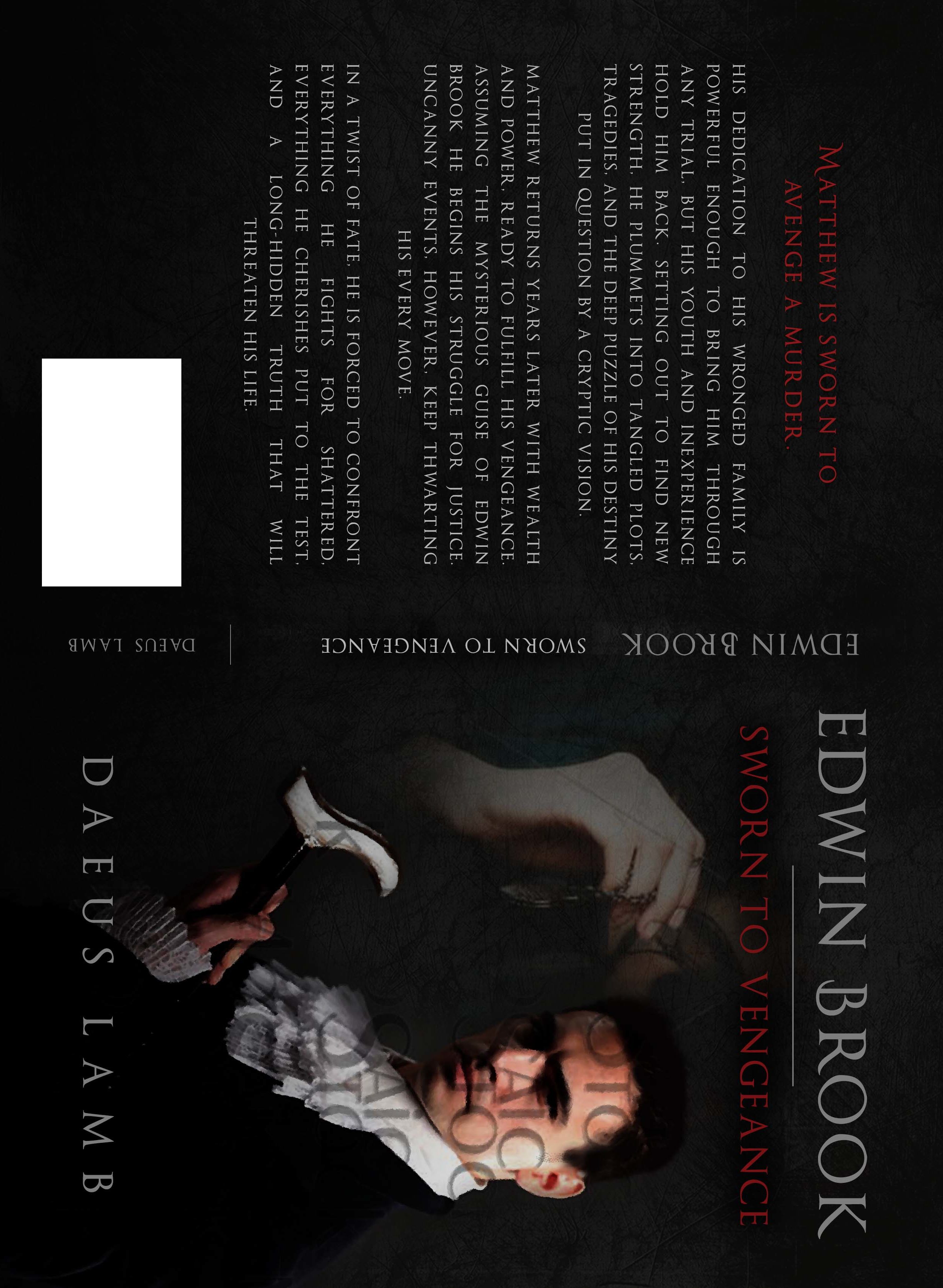
Here. Let me see if it will appear bigger if I turn it sideways.
-
Daeus replied to the topic Book Cover Opinions #2 in the forum Art 9 years, 9 months ago
@i-j-anderson Thanks! Regardless of the girl’s age, do you think she fits well aesthetically? Does she look a bit too ghostly or not match the coloring? Do you think maybe she could fit perfect, but there needs to be certain edits first?
There’s no actual problem with her age, I just wanted her to be more like six, but I’ll compromise on that for…[Read more]
-

Hope Ann replied to the topic Book Cover Opinions #2 in the forum Art 9 years, 9 months ago
I like that cover. Perhaps the red could be a bit bolder so it stands out more. My one thought was that if the man was in action and/or wore some red it would pop more. But I don’t know if that is possible. Also…what is he holding?
I don’t care for the background picture, though a locket by itself could work. The hand and locket could work, but…[Read more]
-
Daeus replied to the topic Book Cover Opinions #2 in the forum Art 9 years, 9 months ago
Ahh! Hold on, Kate. Don’t die.
Sorry, folks. Kate’s dead. Who’s gonna write her eulogy?
-
Daeus replied to the topic Book Cover Opinions #2 in the forum Art 9 years, 9 months ago
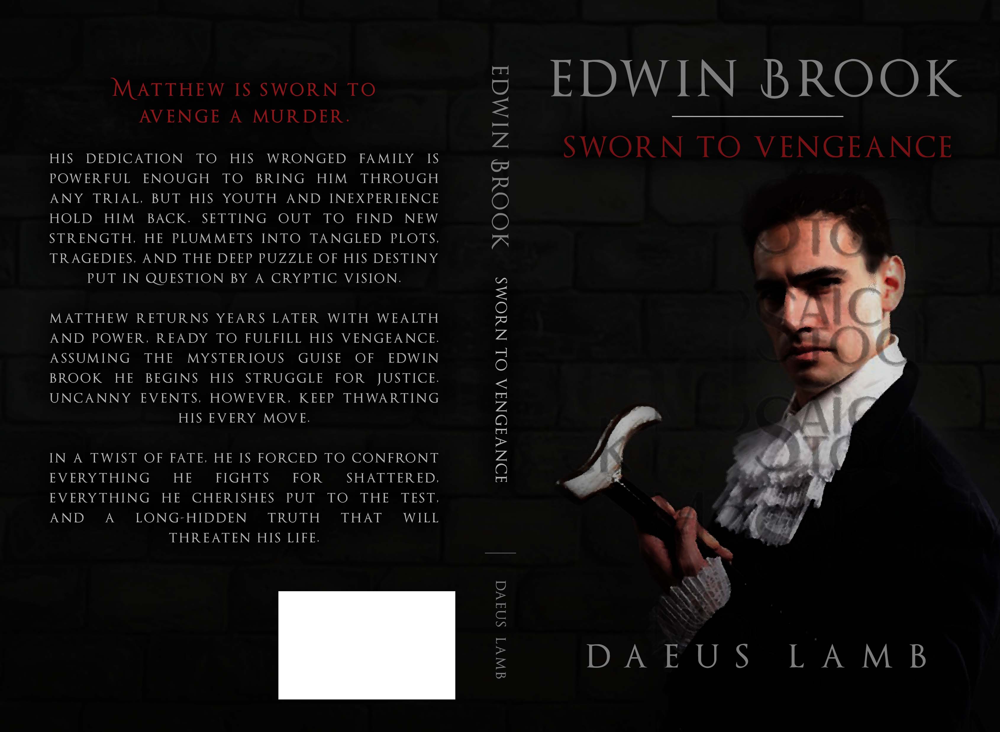
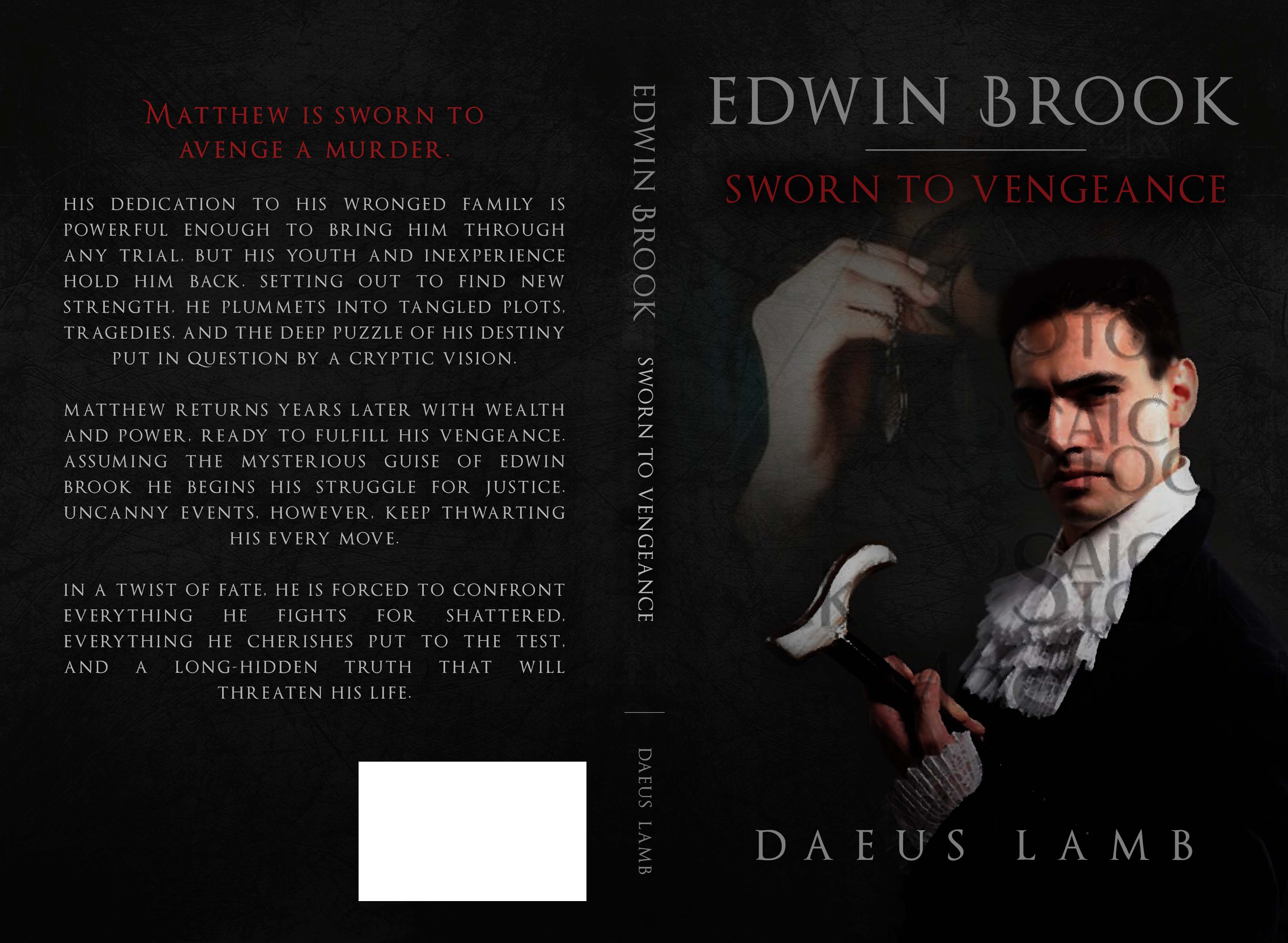
vwat? vwat is dis?
Oh, I think I know what it is.
-
Kate Flournoy replied to the topic Book Cover Opinions #2 in the forum Art 9 years, 9 months ago
No… maybe I should just wait until the internet connection isn’t so spotty. That shouldn’t affect it, but maybe it does. And I’m about to lose signal anyway…
-
Daeus replied to the topic Book Cover Opinions #2 in the forum Art 9 years, 9 months ago
-
Kate Flournoy replied to the topic Book Cover Opinions #2 in the forum Art 9 years, 9 months ago
Huh… that is weird. I’m having internet troubles, maybe that’s it?
-
Daeus replied to the topic Book Cover Opinions #2 in the forum Art 9 years, 9 months ago
@kate-flournoy Really? I can see it. This is a bit weird… Let me see if I can do it another way here.
-
Daeus replied to the topic Book Cover Opinions in the forum Art 9 years, 9 months ago
Thanks everybody! Great comments.
@winter-rose @emma-flournoy I think the main problem with the font is definitely the color, though I think you might be right in saying the font could be better too.
So if you were to choose a different font, what would it look like?
-
Kate Flournoy replied to the topic Book Cover Opinions #2 in the forum Art 9 years, 9 months ago
@Daeus it’s not showing up…
-
Daeus started the topic Book Cover Opinions #2 in the forum Art 9 years, 9 months ago
Hi again,
You see, I’m getting another cover too and I’d love your opinion on it.
The first one is the original design. The brick background is not staying, so no need to comment on that. It will probably be more like what you see in the second one. I’m thinking of asking if the font on the back could be italicized. My one thought with the first…[Read more]
- Load More