-

Daeus replied to the topic Book Cover Opinions #2 in the forum Art 9 years, 6 months ago
@kate-flournoy Thanks. You probably saved me from a premature death by worry. I might be able to work the nose in too, but we’ll see.
-
Daeus replied to the topic Book Cover Opinions #2 in the forum Art 9 years, 6 months ago
Alright. I think I’ve finally settled on an idea here. I’m thinking I’ll have the guy shrunken and focusing in just on him as a bust shot, leaving out his hand. I’ll put him down in the bottom 3/10ths of the page in the right-hand corner. On the left-hand side of the bottom 3/10ths of the page, I’ll have this letter from the story being consumed…[Read more]
-
Daeus replied to the topic Book Cover Opinions #2 in the forum Art 9 years, 6 months ago
Ok, folks.
So while we’re here, I thought I’d share a lesson I just learned about book covers. I went throughout our house and looked at all the novels we have then went and browsed the classics section on amazon. Here’s what I learned about what makes a good book cover.
#1 It’s simple. You don’t have to study it, you understand everything…[Read more]
-
Daeus replied to the topic Book Cover Opinions #2 in the forum Art 9 years, 6 months ago
@dragon-snapper Oh, yeah. The girl would be nixed.
Here’s another idea I had. What if I had the guy without his cane thingy (a little more zoomed up on his face) and then put him at the very bottom of the page with flames licking around him and then transitioned into a plain white and made the font more prominent. (in which case I would also…[Read more]
-
Daeus replied to the topic Book Cover Opinions #2 in the forum Art 9 years, 6 months ago
Thanks, @dragon-snapper. The letter over his face will be removed when the design is done.
Here’s another idea I just had. What if I could get a crack going down the center. On the right side I could keep it black, but on the left side I could make it white. Perhaps the font would be adjusted to fit that. I don’t know. I would like to put…[Read more]
-
Daeus replied to the topic Book Cover Opinions #2 in the forum Art 9 years, 6 months ago
Ok, here’s a note. The themes of this book are.
Justice
Destiny
LovePretty much in that order too. Now here’s the #1 impression I want to make with the cover. I want to make it seem like the character is struggling over some issue, important choice, or haunting past.
-
Daeus replied to the topic Book Cover Opinions #2 in the forum Art 9 years, 6 months ago
@kate-flournoy So here’s the best idea I’ve come up with so far. You know that letter he wrote to his sister then burned in the fire? What if I were to show that on the top (as an actual letter of course) and then have the flames licking it from the bottom and a black at the bottom of the page that mostly shrouds Edwin until it morphs into the…[Read more]
-
Daeus replied to the topic Book Cover Opinions #2 in the forum Art 9 years, 6 months ago
@mark-kamibaya Do you think it’s because of the girl, or would it look that way even if I took the girl out and added something to make it look more literary or actiony?
-
Daeus replied to the topic Book Cover Opinions #2 in the forum Art 9 years, 6 months ago
@mark-kamibaya Ahgh! That’s just what I don’t want!
@kate-flournoy Vampires. Ugh. That’s why I didn’t like the girl’s affect. You’re right. *grimaces*
So I’m gonna try to reimagine this cover. I like the guy, but maybe something else needs to change. Maybe even forget the guy? Who knows?
Now if any of you have any ideas, I’d gladly take them,…[Read more]
-
Daeus replied to the topic Book Cover Opinions in the forum Art 9 years, 6 months ago
Ah, yes, I was thinking a redish-gold actually.
-
Daeus replied to the topic Book Cover Opinions #2 in the forum Art 9 years, 6 months ago
@hope Let’s hope the mice don’t eat her. Mice do that, you know.
You’re probably right about just having the hand. I’m thinking I’ll try for just a locket, thought perhaps the girl and/or just hand could be edited to work.
-
Daeus replied to the topic Book Cover Opinions #2 in the forum Art 9 years, 6 months ago
Here. Let me see if it will appear bigger if I turn it sideways.
-
Daeus replied to the topic Book Cover Opinions #2 in the forum Art 9 years, 6 months ago
@i-j-anderson Thanks! Regardless of the girl’s age, do you think she fits well aesthetically? Does she look a bit too ghostly or not match the coloring? Do you think maybe she could fit perfect, but there needs to be certain edits first?
There’s no actual problem with her age, I just wanted her to be more like six, but I’ll compromise on that for…[Read more]
-

Hope Ann replied to the topic Book Cover Opinions #2 in the forum Art 9 years, 6 months ago
I like that cover. Perhaps the red could be a bit bolder so it stands out more. My one thought was that if the man was in action and/or wore some red it would pop more. But I don’t know if that is possible. Also…what is he holding?
I don’t care for the background picture, though a locket by itself could work. The hand and locket could work, but…[Read more]
-
Daeus replied to the topic Book Cover Opinions #2 in the forum Art 9 years, 6 months ago
Ahh! Hold on, Kate. Don’t die.
Sorry, folks. Kate’s dead. Who’s gonna write her eulogy?
-
Daeus replied to the topic Book Cover Opinions #2 in the forum Art 9 years, 6 months ago
vwat? vwat is dis?
Oh, I think I know what it is.
-
Daeus replied to the topic Book Cover Opinions #2 in the forum Art 9 years, 6 months ago
-
Daeus replied to the topic Book Cover Opinions #2 in the forum Art 9 years, 6 months ago
@kate-flournoy Really? I can see it. This is a bit weird… Let me see if I can do it another way here.
-
Daeus replied to the topic Book Cover Opinions in the forum Art 9 years, 6 months ago
Thanks everybody! Great comments.
@winter-rose @emma-flournoy I think the main problem with the font is definitely the color, though I think you might be right in saying the font could be better too.
So if you were to choose a different font, what would it look like?
-
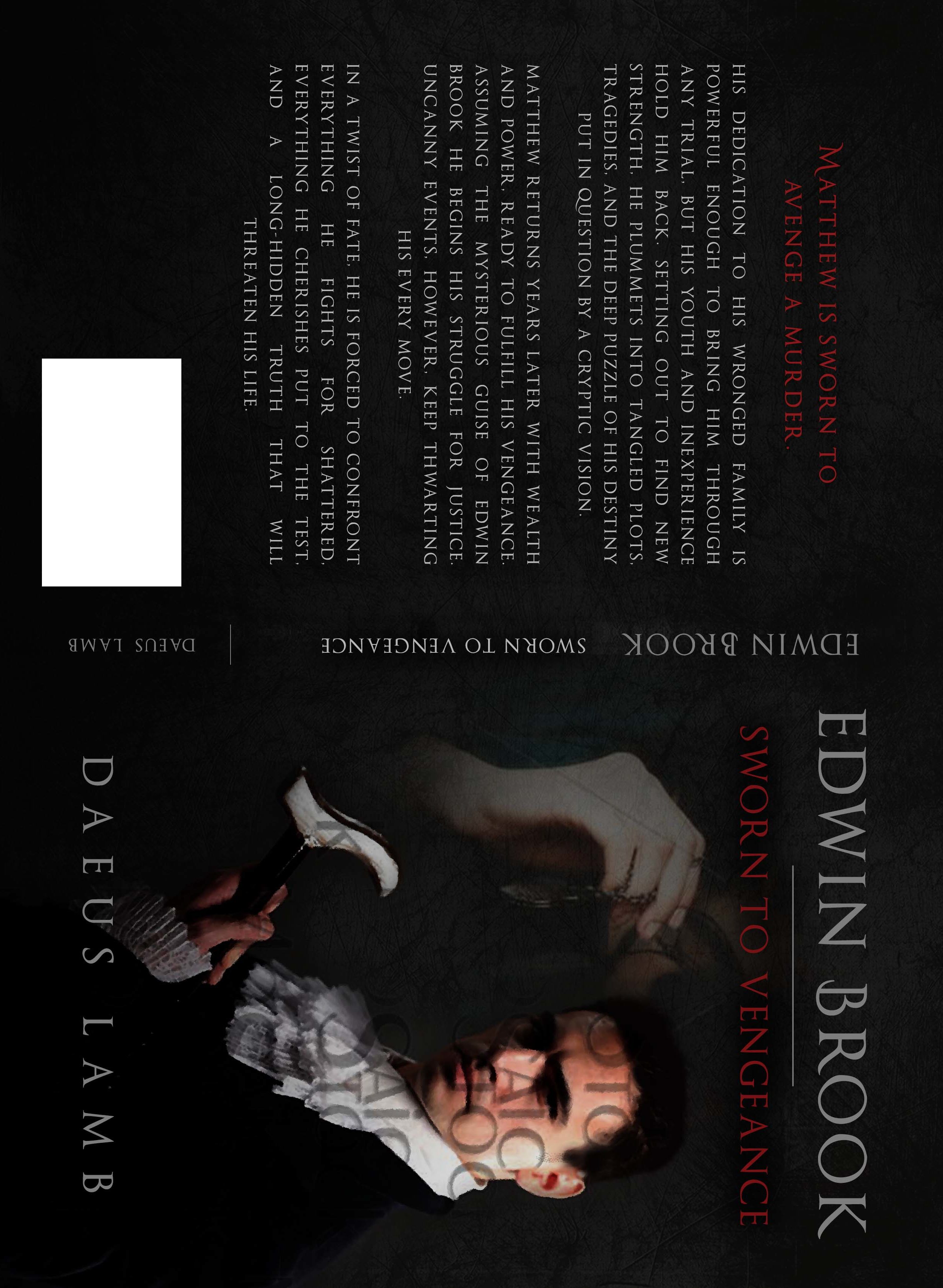
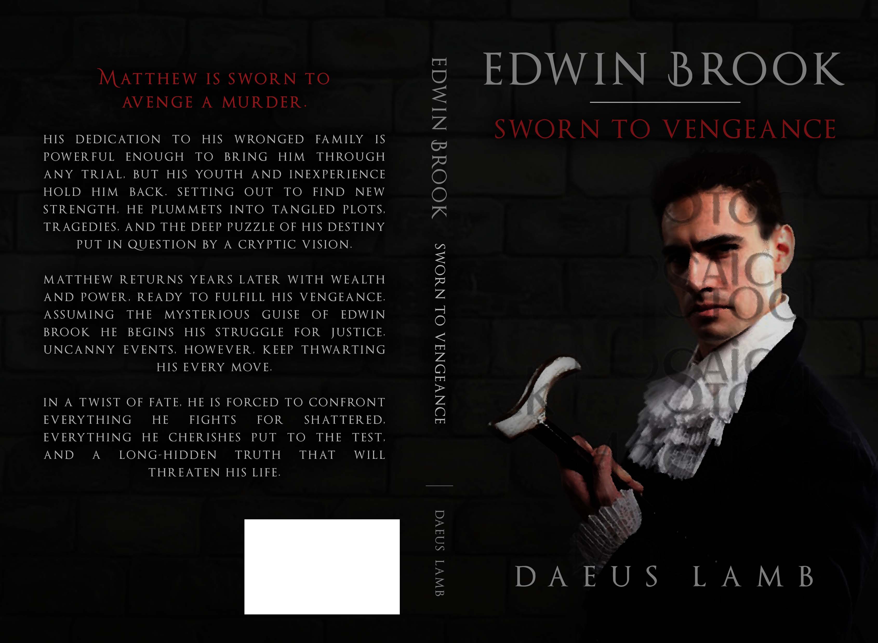
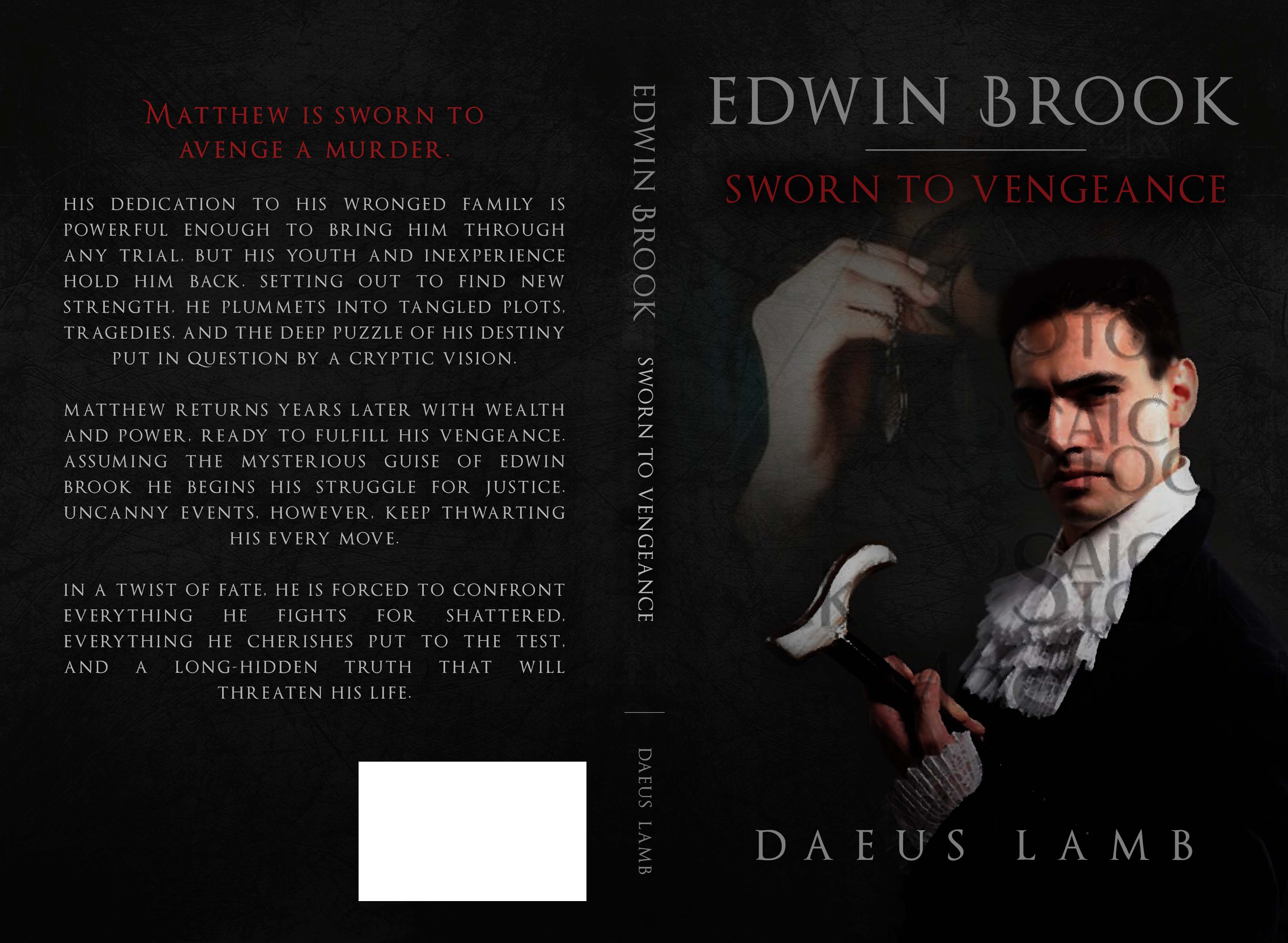
Daeus started the topic Book Cover Opinions #2 in the forum Art 9 years, 6 months ago
Hi again,
You see, I’m getting another cover too and I’d love your opinion on it.
The first one is the original design. The brick background is not staying, so no need to comment on that. It will probably be more like what you see in the second one. I’m thinking of asking if the font on the back could be italicized. My one thought with the first…[Read more]
- Load More