Home Page › Forums › Fiction Writing › Publishing & Platform › Pinterest
Tagged: @daeus
- This topic has 53 replies, 14 voices, and was last updated 8 years, 2 months ago by
Anonymous.
-
AuthorPosts
-
December 23, 2017 at 5:02 pm #57562
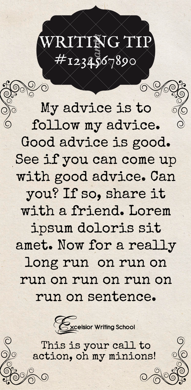
I guess I could do something like this:
??????????????????????
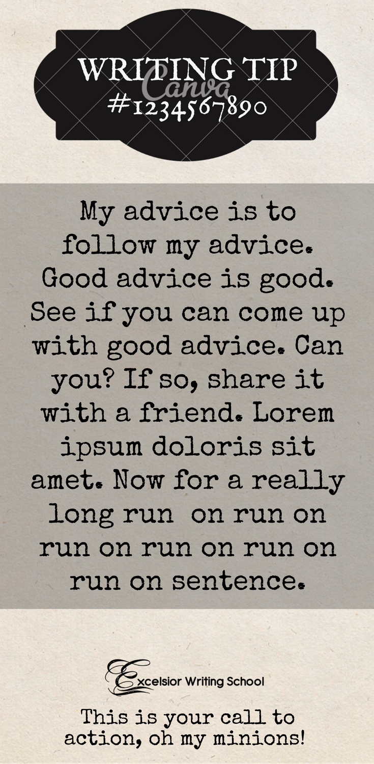
December 23, 2017 at 5:10 pm #57563@daeus I like what you’ve done above, but I personally prefer the first graphic, in the darker shade, but Kate’s right that there needs to be a divider of sorts between graphic and text.
INFP Queen of the Kingdom commander of an army of origami cranes and a sabre from Babylon.
December 23, 2017 at 7:09 pm #57568@Daeus hm… better-ish? I like the first re-do, but it isn’t perfect. What program are you using to put these together? Because putting in white boxes is like… as basic as the abcs…
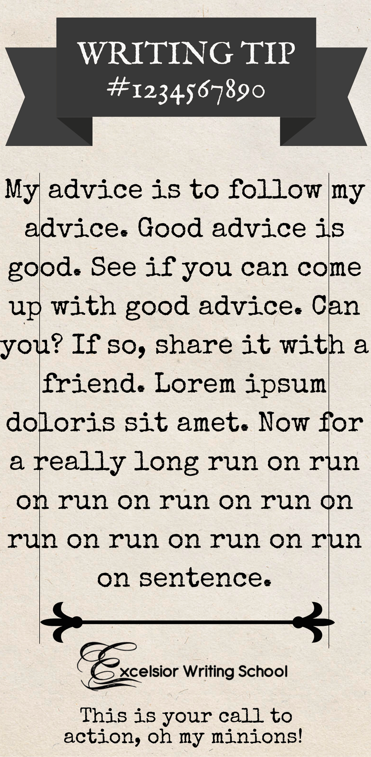
December 23, 2017 at 7:11 pm #57569You know what, maybe you could just put two straight and fairly defined black lines down the sides of the one you fixed, about half an inch from the edge.
December 23, 2017 at 7:53 pm #57573@daeus – I love what you’re doing with the graphics and quotes…personally, that’s what I search and pin on Pinterest for the most part: quotes. 🙂
Personally, I do think some type of border might help. 🙂 Or bringing in the text a little bit, by letting the background be the border.
Also, I get to create a lot of graphics every week for my small business, so if you’d like the names of a couple of the programs/apps I use, just let me know. What I’ve found is pleasing to the eye is crisp and clean. Having a very plain background with text…but making the text centered or in the middle of the graphic. Or having a textured background, but again, making the text a bit smaller so that the background forms a border…does that make any sense?
Again, that’s just my opinion and things I’ve seen around as I watch social media. 🙂 😀
December 26, 2017 at 11:41 am #57686@lifeofkatie Do you have an example of what you’re talking about. I can’t quite imagine it.
And, sure, I’d be interested to know what programs you use.
@kate-flournoy I’m not exactly sure what you mean. :/I’m using Canva.
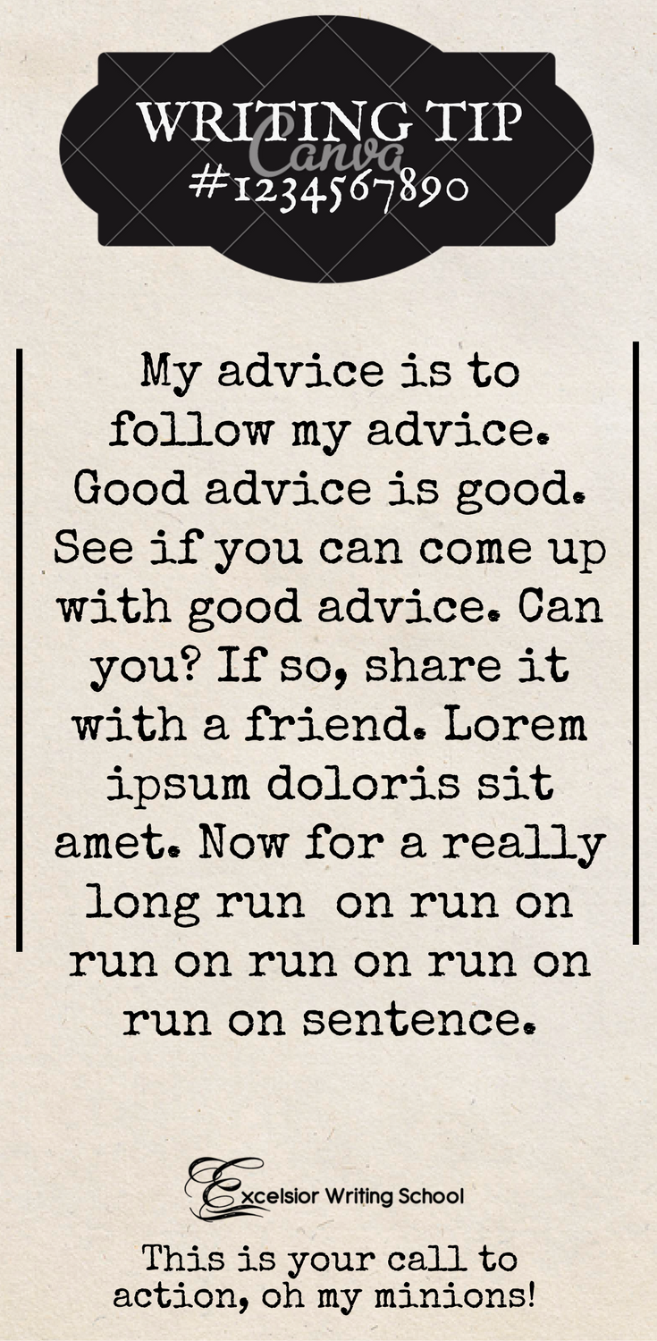
I did experiment with a border like you were talking about. Here are three designs. None of them are amazing, but I think maybe the one with the black border could be turned into something.
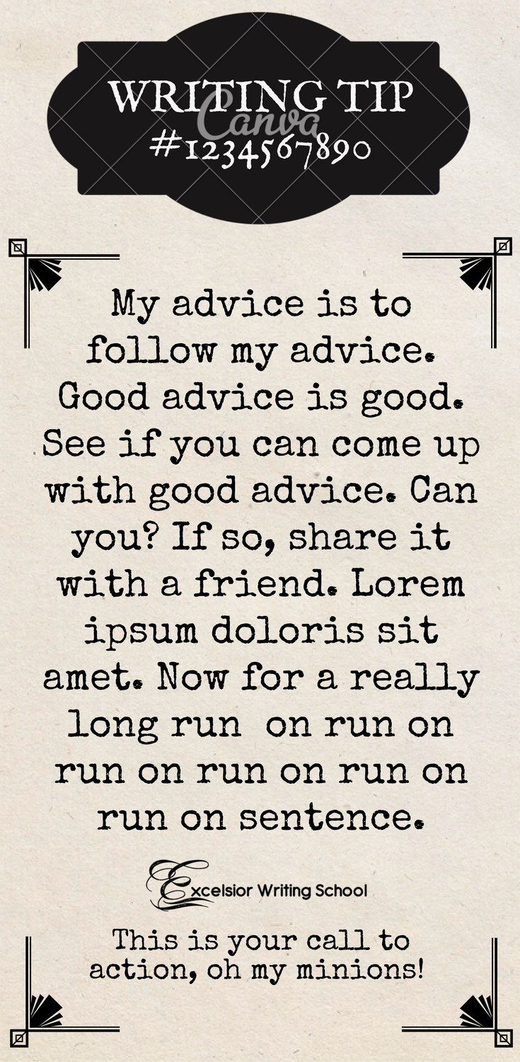
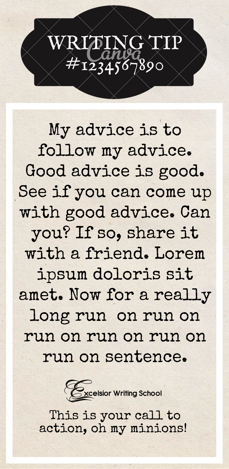

??????????????????????
December 26, 2017 at 12:23 pm #57687Daeus here— I just took one of your templates and put rough lines where I was talking about. If you shrink the text inside those lines, it makes it very neat and tidy and leaves clean, empty edges to frame the quote and make it look complete.
 December 26, 2017 at 12:23 pm #57688December 26, 2017 at 12:41 pm #57692
@kate-flournoy Ah, okay. Here are two more examples then.
Don’t ask me why the lines on #1 are short. I designed them a little longer.
??????????????????????
December 26, 2017 at 12:41 pm #57693@daeus what does Lorem ipsum doloris sit amet mean!??! I see that everywhere!
ENTP, Aether-borg Hero with cape obsession and fascination with swords.
https://forums.theaetherliDecember 26, 2017 at 12:43 pm #57694@aislinn-mollisong It’s from an old latin medical book and people just use it for filler.
??????????????????????
December 26, 2017 at 12:57 pm #57695@daeus Ahhhh….that makes so much sense now. Thank you! And great template things!
ENTP, Aether-borg Hero with cape obsession and fascination with swords.
https://forums.theaetherliDecember 26, 2017 at 12:59 pm #57696@Daeus yes! Much better; either of those would work very nicely.
December 26, 2017 at 1:00 pm #57697Nice turtles. 😀
December 26, 2017 at 1:04 pm #57698@kate-flournoy I felt it expressed my personality nicely.
??????????????????????
-
AuthorPosts
- You must be logged in to reply to this topic.


