Home Page › Forums › Other Art Forms › Art › Book Cover Opinions #2
- This topic has 96 replies, 14 voices, and was last updated 9 years, 1 month ago by
 Rolena Hatfield.
-
AuthorPosts
-
December 29, 2016 at 8:20 pm #23410
Hi again,
You see, I’m getting another cover too and I’d love your opinion on it.
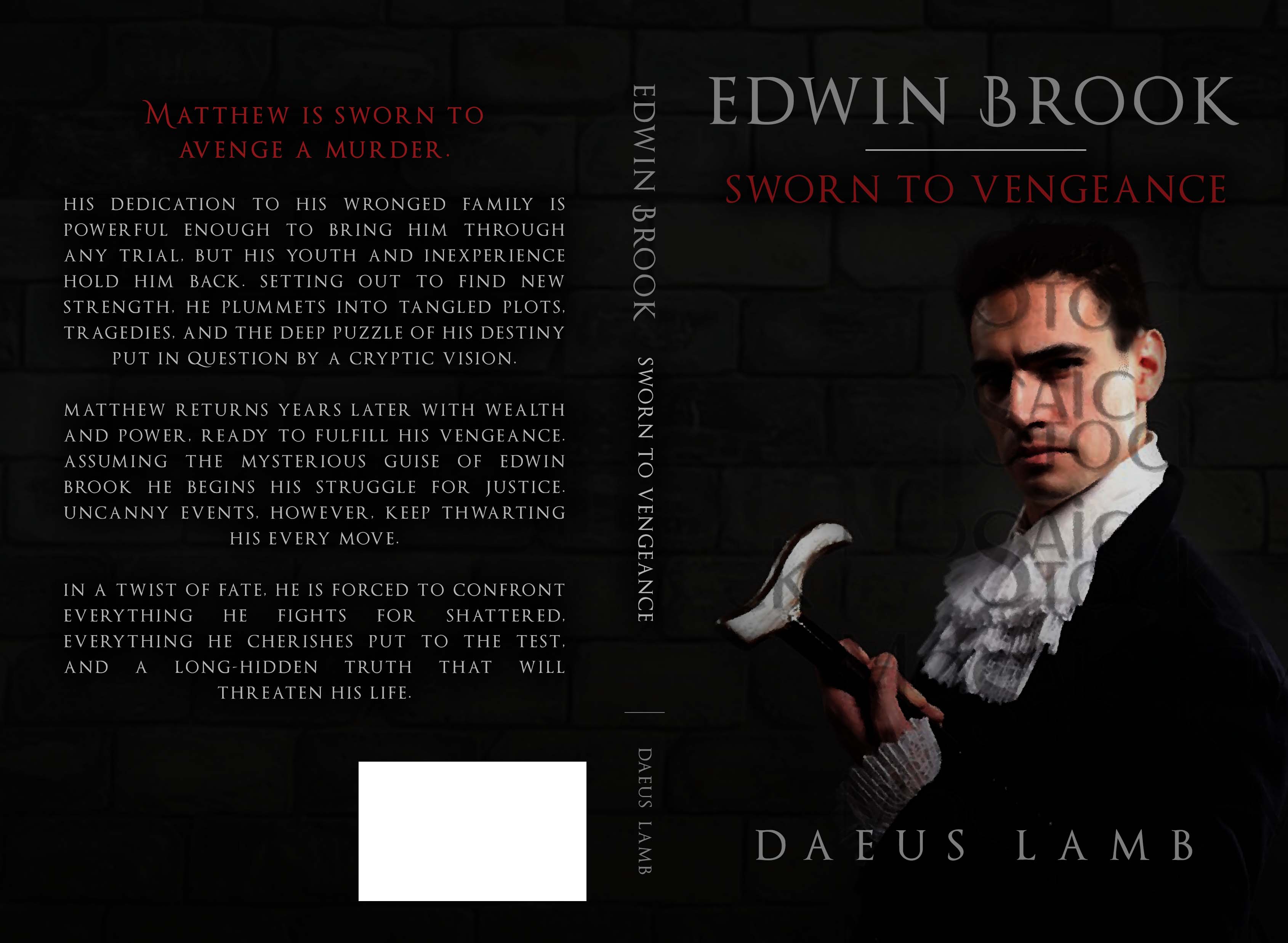
The first one is the original design. The brick background is not staying, so no need to comment on that. It will probably be more like what you see in the second one. I’m thinking of asking if the font on the back could be italicized. My one thought with the first one (besides the background) is that it’s a little plain with the guy just by himself, so I want to add in something else. I really like the scarlet font, and I like the silver font too, but I’m still not quite sure about it. Perhaps it could be better?
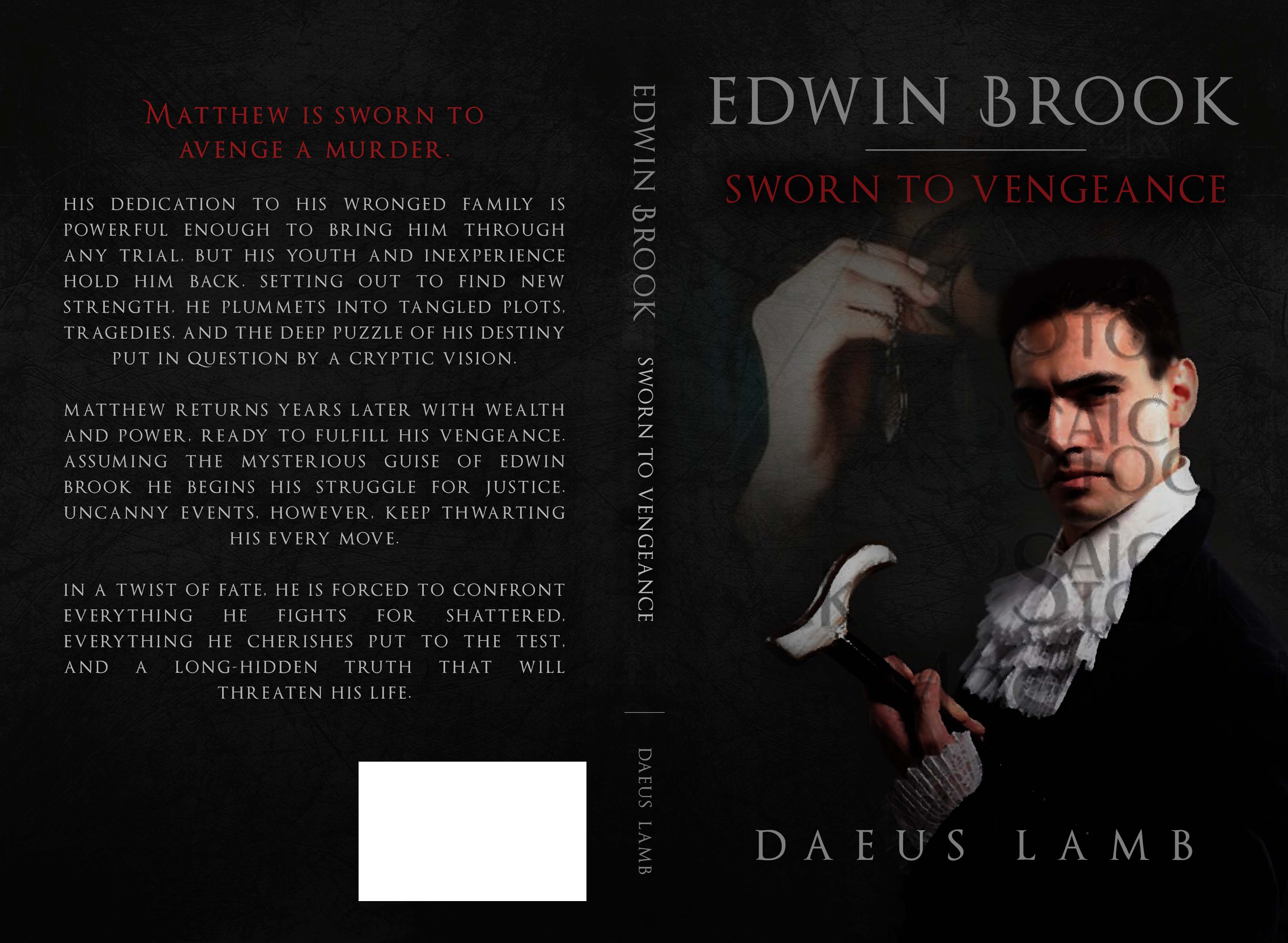
The second one shows an idea I had for a girl with a locket in the background. I think she looks too old though, and she doesn’t really match either. (this is the only image of a girl with a locket my designer could find anywhere.) My current thoughts on this are that I definitely like having an offset, but it needs to be changed or replaced. I mean, it almost looks freaky as it is. One thought is to get a separate image of a locket all by itself and another thought is to see if I can take out the girl and just leave her hand with the locket. Any ideas welcome.
@kate-flournoy @his-instrument @hope (cause you helped with this)Now, let’s see if this thing will work…
??????????????????????
December 29, 2016 at 8:26 pm #23411@Daeus it’s not showing up…
December 29, 2016 at 8:29 pm #23413@kate-flournoy Really? I can see it. This is a bit weird… Let me see if I can do it another way here.
??????????????????????
December 29, 2016 at 8:32 pm #23414Huh… that is weird. I’m having internet troubles, maybe that’s it?
December 29, 2016 at 8:33 pm #23415December 29, 2016 at 8:34 pm #23416No… maybe I should just wait until the internet connection isn’t so spotty. That shouldn’t affect it, but maybe it does. And I’m about to lose signal anyway…
December 29, 2016 at 8:35 pm #23417vwat? vwat is dis?
Oh, I think I know what it is.


??????????????????????
December 29, 2016 at 8:36 pm #23418Ahh! Hold on, Kate. Don’t die.
Sorry, folks. Kate’s dead. Who’s gonna write her eulogy?
??????????????????????
December 29, 2016 at 9:05 pm #23419Even though the girl in the background might be too old, I do think that a faded image looks really good just to balance it out. I think if I had a criticism, it’s a little difficult to tell the difference between the commas and periods, but maybe it’s because I’m on my phone 😛
December 29, 2016 at 9:06 pm #23420I like that cover. Perhaps the red could be a bit bolder so it stands out more. My one thought was that if the man was in action and/or wore some red it would pop more. But I don’t know if that is possible. Also…what is he holding?
I don’t care for the background picture, though a locket by itself could work. The hand and locket could work, but I’ve a feeling it would look strange. @kate-flournoy would know better, but alas, she has left us in the night alone. Mice in the wifi box will do that… Perhaps she will return with the dawn.
INTJ - Inhumane. No-feelings. Terrible. Judgment and doom on everyone.
December 29, 2016 at 9:11 pm #23421@i-j-anderson Thanks! Regardless of the girl’s age, do you think she fits well aesthetically? Does she look a bit too ghostly or not match the coloring? Do you think maybe she could fit perfect, but there needs to be certain edits first?
There’s no actual problem with her age, I just wanted her to be more like six, but I’ll compromise on that for aesthetics.
??????????????????????
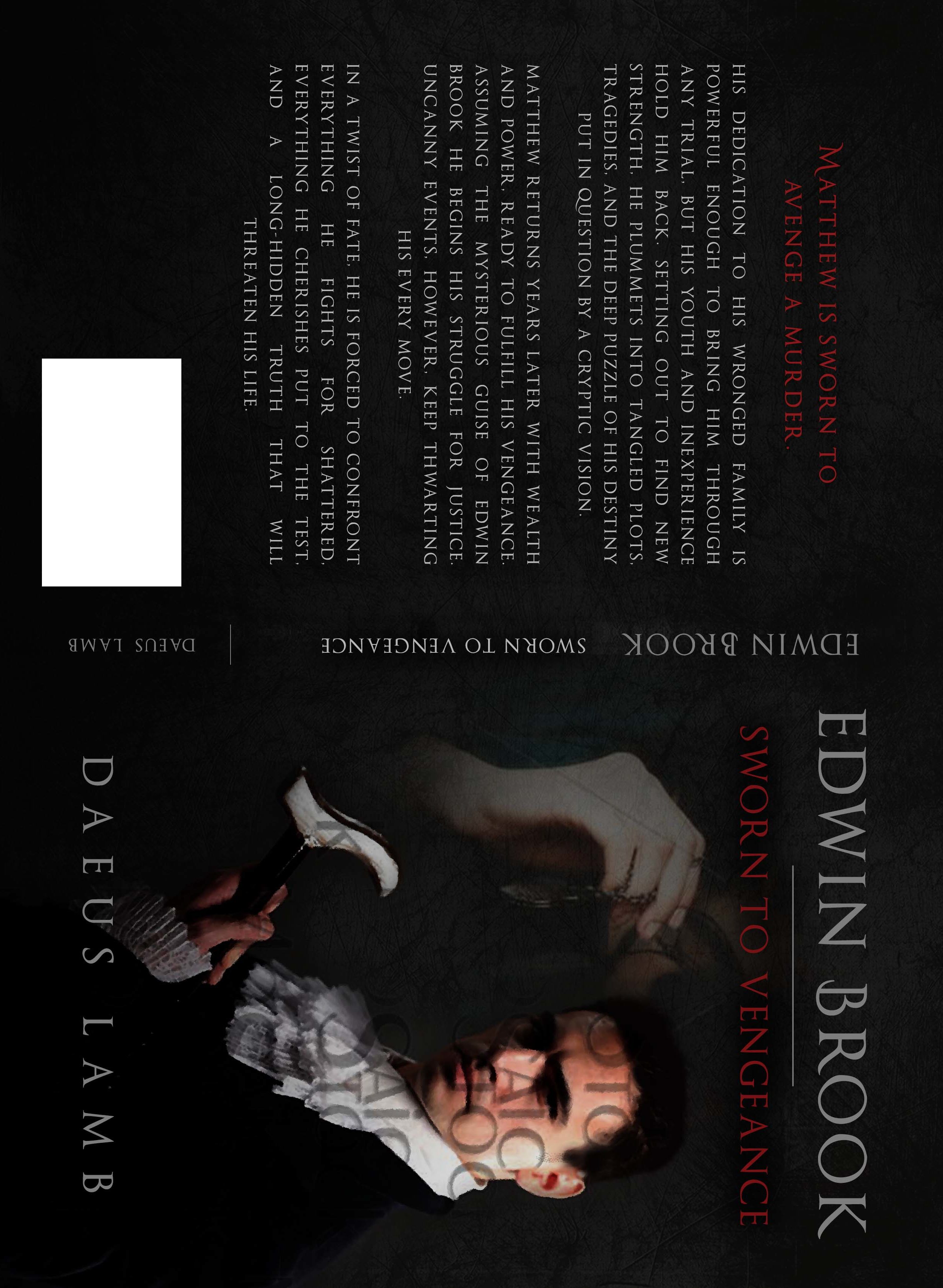
December 29, 2016 at 9:14 pm #23422Here. Let me see if it will appear bigger if I turn it sideways.

??????????????????????
December 29, 2016 at 9:17 pm #23423Is it a walking stick he’s holding or a last? It certainly doesn’t look like any weapon I know of. I can barely see the girl’s face as it is, so it’s hard to tell her age, but I like the picture with her better — it helps to have something in the background. Covers where there’s a dark background and a single figure have a tendency to look amateurish, as if somebody Photoshopped something in with the words “that will work”. When I look closely I wonder if the girl’s hand isn’t disproportionately big compared to the guy’s face, but if it were much smaller it might not fill the space right. I don’t think she looks ghostly — having her not faded out at all might cause serious problems with our minds trying to fit two physical objects in the same place at the same time. You can take a lot of liberties with a cover that you otherwise couldn’t. On the screen it’s hard to tell periods and commas apart, as Joy said, but maybe in a print copy it would be easier.
You will draw water joyfully from the springs of salvation. (Isaiah 12:3)
December 29, 2016 at 9:18 pm #23424@hope Let’s hope the mice don’t eat her. Mice do that, you know.
You’re probably right about just having the hand. I’m thinking I’ll try for just a locket, thought perhaps the girl and/or just hand could be edited to work.
??????????????????????
December 29, 2016 at 9:18 pm #23425The bigger picture is nice, but I still can’t tell periods and commas apart.
You will draw water joyfully from the springs of salvation. (Isaiah 12:3)
-
AuthorPosts
- You must be logged in to reply to this topic.


