Home Page › Forums › Other Art Forms › Art › Graphic design advice?
- This topic has 23 replies, 8 voices, and was last updated 8 years, 5 months ago by
 katie.
-
AuthorPosts
-
November 4, 2017 at 1:28 pm #51459
Hi KeePers,
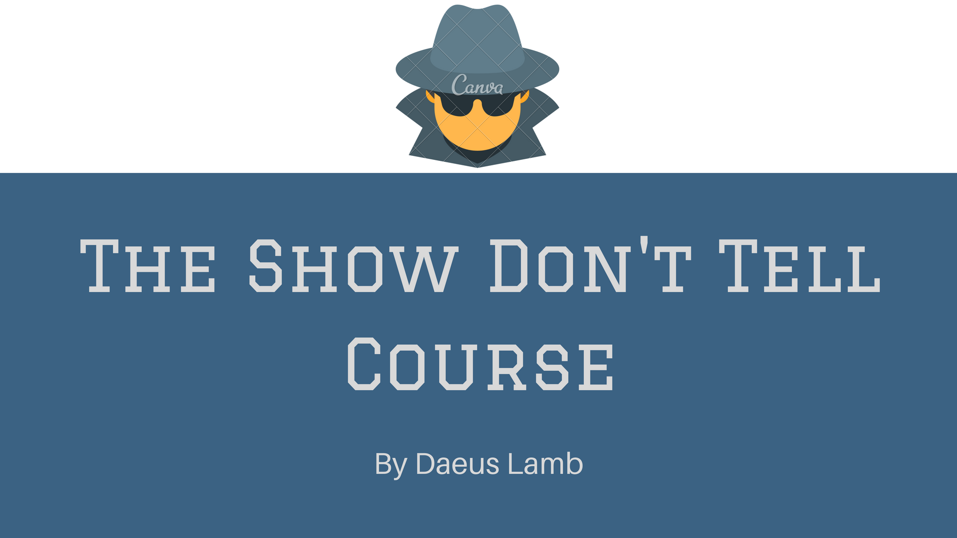
I’m trying to design a main slide for a course, but I’m not exactly a graphics designer, so I could use some advice. I know it’s okay, but I think it can be better.
Thoughts?

??????????????????????
November 4, 2017 at 1:30 pm #51460There wouldn’t be the watermark on the final design, of course. 😉
??????????????????????
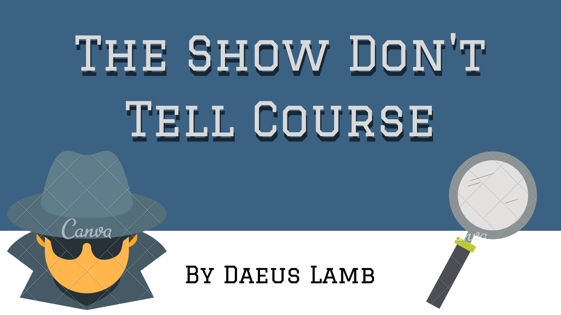
November 4, 2017 at 1:33 pm #51461@daeus what if you put the guy’s head in the bottom left corner of the blue box, and maybe a magnifying glass or something in the other corner? Would that work?
????
ENFJ-T. Arbitrary. Greet at your own risk. *trips on a rock*November 4, 2017 at 1:36 pm #51462Haha, I love this. Clever.
I’m…not a graphic design person, but it looks like you’ve got a solid start.
Writer. Dreamer. Sometimes blogger. MBTI mess. Lover of Jesus and books.
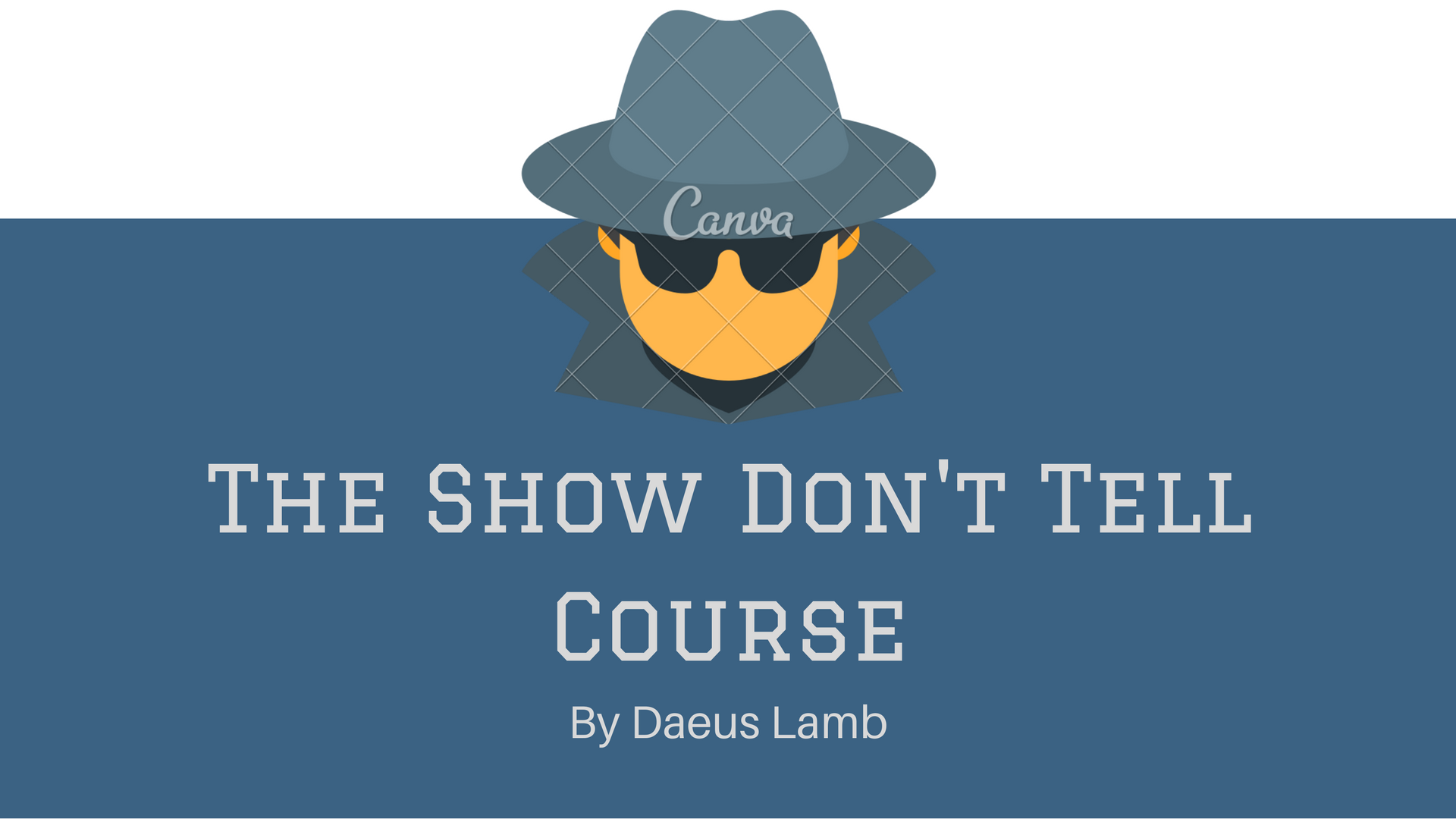
November 4, 2017 at 2:00 pm #51467Here’s another option.

??????????????????????
November 4, 2017 at 2:00 pm #51468I still think I like the first one better.
Writer. Dreamer. Sometimes blogger. MBTI mess. Lover of Jesus and books.
November 4, 2017 at 2:04 pm #51469@daeus I actually like the second one better. @that_writer_girl_99 ?
????
ENFJ-T. Arbitrary. Greet at your own risk. *trips on a rock*November 4, 2017 at 2:07 pm #51470Anonymous
- Rank: Eccentric Mentor
- Total Posts: 1330
@daeus I like the second one better, but I don’t know about putting the guy in the very middle. I tend to agree with @lady-iliara. I think that you should size it down a little bit and put it in the bottom left corner. You should still overlap it, though, in my opinion.
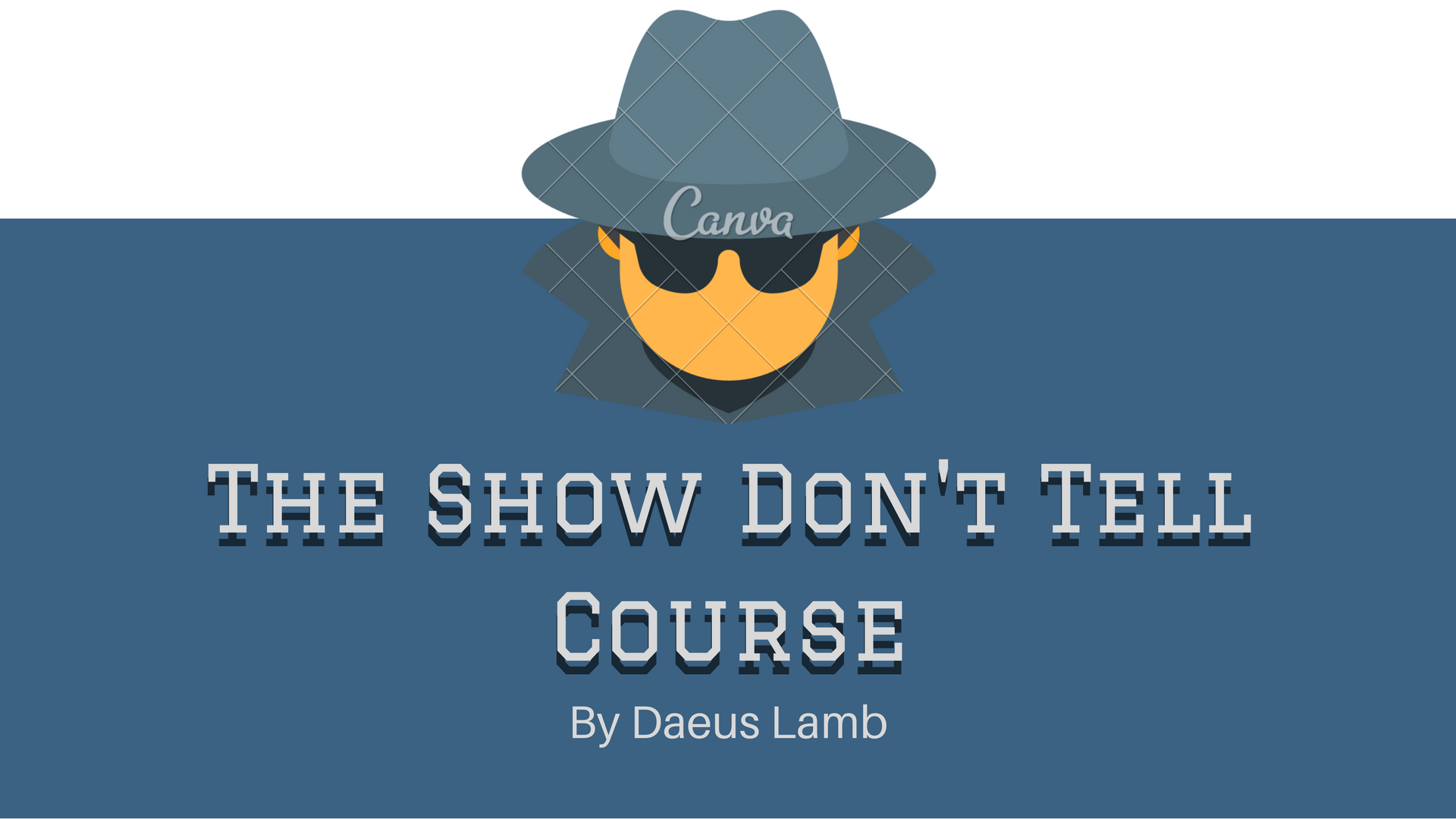
November 4, 2017 at 2:10 pm #51471Here’s #2 with shadows. I’ll see what it looks like if I put the guy in a corner.

??????????????????????
November 4, 2017 at 2:24 pm #51474Here’s what it looks like with the spy in the corner.

??????????????????????
November 4, 2017 at 2:25 pm #51476I think I like that last one best.
ENTP, Aether-borg Hero with cape obsession and fascination with swords.
https://forums.theaetherliNovember 4, 2017 at 2:25 pm #51477Let me get @kate-flournoy in on this.
??????????????????????
November 4, 2017 at 2:28 pm #51478@daeus Yeah, that looks good!
????
ENFJ-T. Arbitrary. Greet at your own risk. *trips on a rock*November 4, 2017 at 2:33 pm #51479Anonymous
- Rank: Eccentric Mentor
- Total Posts: 1330
@daeus Definitely like the last one the best. Especially with the shadows. 😉
November 4, 2017 at 2:35 pm #51480Anonymous
- Rank: Eccentric Mentor
- Total Posts: 1330
@daeus I think that you should size the dude and magnifying glass down a little bit. The size right now kind of distracts the focus from the words.
-
AuthorPosts
- You must be logged in to reply to this topic.

