
Home Page › Forums › Other Art Forms › Art › My First Book Cover
- This topic has 3 replies, 3 voices, and was last updated 8 years, 1 month ago by
 Hannah Carmichael.
-
AuthorPosts
-
February 17, 2016 at 8:52 pm #9259
*glances around* *no one else has posted in this board* *cracks knuckles* ‘Kay, hello people. So, I’m just posting this for the fun of posting. (and to be the first to make a topic in this section! Ha ha! 😛 jk kinda.) But after Nanowrimo I cashed in on that offer they gave to get an irl copy of your book, so of course this mean… I had to have a cover.
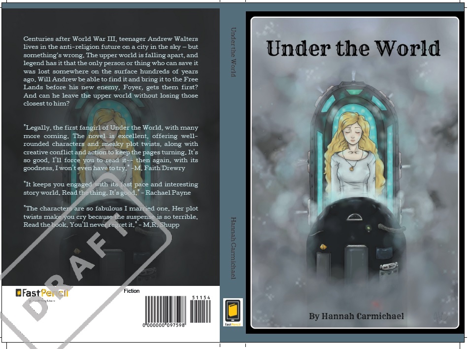
So I used a picture I had finished drawing back in December. Just to give it a try. But I’m curious. If you guys saw this book on a shelf, how many of you would be inclined to actually read it, just from looking at the cover?
Also, judging by the cover, what age range would you guess the novel to be aimed at?
(Keep in mind that this was originally just for my personal copy and so the Synopsis is terrible, and ignore the comments from friends on the back because they’re just being sweet. XD Thank you!)
http://orig09.deviantart.net/80c1/f/2016/048/1/f/working_cover_utw_by_godsgirl4444-d9s5ol4.jpgFebruary 18, 2016 at 9:02 am #9263The cover makes me curious about what happens, so that’s a plus. The art is good, but the font, background, and general design have a lackluster effect. Personally, the cover would not make me want to read it, but I think with a professional redesign the artwork would be greatly complemented. My guess would be that the cover art style would appeal mainly to younger audiences, perhaps 7-13.
🐢🐢🐢🐢🐢🐢🐢🐢🐢🐢🐢🐢🐢🐢🐢🐢🐢🐢🐢🐢🐢🐢
February 18, 2016 at 12:05 pm #9264The girl and the capsule she’s in are well done @watersnail— take it from one artist to another. And an extraordinarily picky artist at that… But you could definitely stand to work on the background and the font. Just give it more depth— I would say add color to the background behind the steam, preferably dark tones— deep brownish reds, with maybe soft red lights intermixed to make the ‘sci-fi’ effect stronger. Or if she’s floating in something, as it looks like she might be, just deepen the vividness of whatever it is she’s floating in. Don’t do it too strong or you’ll eclipse the girl, but as it is, the first impression is ‘yikes— grey.’ You might also try adding shadows in a few of the corners— just soft shadows, nothing overstated, to give us a visual boundary. For the font, I would say something simple. Something with clean lines, not a lot of curves, and not a heavily accented style.
But the book does look interesting, so good work and keep it up. 🙂
-
This reply was modified 8 years, 2 months ago by
 Kate Flournoy.
@daeus Thank you for the feedback, that’s actually really helpful for consideration.
@kate-flournoy Thank you so much for the art tips!!!
Thank you both for looking at this and giving me feedback. I really appreciate it a lot! (and sorry for being so late to reply.) -
This reply was modified 8 years, 2 months ago by
-
AuthorPosts


- You must be logged in to reply to this topic.