Home Page › Forums › Fiction Writing › Publishing & Platform › Cover Feedback
- This topic has 18 replies, 16 voices, and was last updated 6 years, 4 months ago by
 katie.
-
AuthorPosts
-
October 30, 2017 at 11:40 am #50376
Hi KeePers,
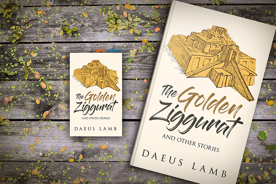
I just got a cover design for a short story I’m writing and I wanted to get your feedback on it.
I personally am very happy with the sharp, clean design, but I do think there’s room for a tiny bit more detail. I’m thinking maybe I should add some very subtly ominous feature, but I’m not sure what that should be. Or maybe the background should have some texture???
Looking forward to your thoughts!
@kate-flournoy @graciegirl @jane-maree @perfectfifths @emma-flournoy @salome01w4g @that_writer_girl_99 @daughteroftheking @dragon-snapper @xonos-darkgrate🐢🐢🐢🐢🐢🐢🐢🐢🐢🐢🐢🐢🐢🐢🐢🐢🐢🐢🐢🐢🐢🐢
October 30, 2017 at 11:56 am #50377@Daeus oooh! I really, really like it. You’re right— the clean, clear format is very smart and refreshing. A little texture in the background might improve on it, but just a little, and I might change my mind if I saw it.
A subtly ominous feature could work… but it would have to be very subtle to not overbalance the nice clean look. *wrinkles face* I’m not sure I have any ideas. If you added a slightly red tint to the shadows on the side of the ziggurat it might accomplish that, but I’m sure there are better ideas.Overall though it’s very impressive. What design service are you using?
@daeus *jaw drops* wow that looks really good… I wouldn’t change a thing personally but if you want to add something; maybe take Kate’s idea add a sunset shadow or something. Looks great! 🙂
~I don’t know what I’m doing~
October 30, 2017 at 12:10 pm #50381@kate-flournoy I used this guy. He gets my thumbs up. I don’t know how he gets away with charging so little. http://bookcovermall.com/custom-design
🐢🐢🐢🐢🐢🐢🐢🐢🐢🐢🐢🐢🐢🐢🐢🐢🐢🐢🐢🐢🐢🐢
October 30, 2017 at 12:17 pm #50384@daeus More texture in the background would probably enhance it…otherwise, it looks great! 😉 *many thumbs up*
A dreamer who believes in the impossible...and dragons. (INFJ-T)
October 30, 2017 at 12:17 pm #50385I dunno, @daeus, but I think it looks fine as-is. The cover is really neat–and I mean that both literally and figuratively.
Writer. Dreamer. Sometimes blogger. MBTI mess. Lover of Jesus and books.
October 30, 2017 at 12:23 pm #50386@daeus I like it! I agree with everyone else, I think a bit of something to make it subtly more ominous would be good. It almost strikes me as non-fiction, something I would read for history class.
October 30, 2017 at 5:17 pm #50414@Daeus it’s pretty cool! You could make the shadows a little heavier which would be a very subtle ominous layer, or add a little shading to the white around the whole picture. Not sure though.
Writing Heroes ♦ Writing Hope // janemareeauthor.com.au
@daeus I would definitely pick that book yp based on the cover. Its really cool 🙂 i approve.
INFP Queen of the Kingdom commander of an army of origami cranes and a sabre from Babylon.
October 30, 2017 at 6:24 pm #50424@daeus *gasp* It’s so professional and traditional, I would run across the library to pick up that book!! XD I don’t have anything to suggest, mostly because I love it as-is. Nicely done!
Blog: https://weridasusual.home.blog/
October 30, 2017 at 6:53 pm #50428Anonymous
- Rank: Eccentric Mentor
- Total Posts: 1330
@daeus I love it! I love the simplicity of the design. Maybe a little bit of texture in the background would be ok. Maybe the sunset idea or maybe some birds flying across the background would be cool.
October 30, 2017 at 9:22 pm #50440@daeus I really like it, I don’t think it necessarily needs anything else. But if you really want something, the thing that comes to mind when you something ominous is (having read some of your story) the image of the goddess the main character keeps thinking of. Though I’m not sure where, or if it would be too in-your-face if you did that.
Currently reading Les Miserables
October 31, 2017 at 5:21 pm #50597@daeus That’s pretty cool! I would add more shadow to the ziggurat and then lightly sketch in a bit of mountains or buildings or desert (or wherever you ziggurat is) in the background so it doesn’t look like it’s just floating in the middle of nowhere. It would look more like it was actually a place, instead of like a mystical thing. 🙂
You can pronounce it however you want.
November 1, 2017 at 7:18 pm #50884 -
AuthorPosts


- You must be logged in to reply to this topic.