
Home Page › Forums › Other Art Forms › Art › Book Cover Opinions
- This topic has 30 replies, 11 voices, and was last updated 7 years, 3 months ago by
 Daeus.
-
AuthorPosts
-
December 30, 2016 at 12:13 pm #23453
Anonymous
- Rank: Eccentric Mentor
- Total Posts: 1486
@Daeus I don’t have a specific font suggestion right now, though losing the fade in color might erase the plastic feel of the letters. You could try messing with different fonts with bevels on their edges and see if they fit better.
December 30, 2016 at 12:16 pm #23455@winter-rose. Hmm. I’m not sure if the gradation in the color is giving it that feel or if it’s just the color. One way or another though, I think I can get it fixed.
Were you thinking something more medieval like these?
http://www.fontspace.com/intellecta-design/salterio
http://www.fontspace.com/aldus/royal
http://www.fontspace.com/dieter-steffmann/deutsche-zierschrift
http://www.fontspace.com/dieter-steffmann/augusta🐢🐢🐢🐢🐢🐢🐢🐢🐢🐢🐢🐢🐢🐢🐢🐢🐢🐢🐢🐢🐢🐢
December 30, 2016 at 7:43 pm #23477@Daeus I wasn’t thinking the font should be changed, just really toned down in color; I had meant for the design under the title when I said something more angular.
I suppose it could work the same way to change the font to something more angular…in fact that might be better ’cause I like sub-title design.
Of those fonts you linked I think Augusta could work nicely, if you decide to change it.
(The other ones were too fancy. 😛 )The master graphic designer who’s come into contact with thousands of different fonts (ahem @Kate-Flournoy) might be able to suggest one that works better than the current one, if her masterly discerning designer eye senses a need for change…
December 30, 2016 at 7:47 pm #23479@Emma-Flournoy *winces* Subtlety is a virtue, my dear. And if it isn’t it should be.
And I like the font as it is. That’s one of my favorite fonts. If popular vote demands I suggest another I shall do my best, but I really don’t think the font needs to be changed.
- Rank: Eccentric Mentor
- Total Posts: 1486
@Daeus I like the last font suggestion, Augusta, because its a little more minimal. An extremely medievalish font might be too much, if you know what I mean.
December 30, 2016 at 9:20 pm #23489@winter-rose Yeah, I do know what you mean. Hopefully I’ll have version two tomorrow.
🐢🐢🐢🐢🐢🐢🐢🐢🐢🐢🐢🐢🐢🐢🐢🐢🐢🐢🐢🐢🐢🐢
December 31, 2016 at 7:17 am #23491@Kate-Flournoy Oh, subtlety? Hmmm…
-
This reply was modified 7 years, 3 months ago by
 Emma Flournoy.
January 3, 2017 at 5:38 pm #23696Well, I’m late, but here are my thoughts, for what they are worth:
I agree with a lot of what’s been said- the things that stick out would be having the ground wet, lighting on the front as well, and fonts being the same-or-close on color, and the buildings do seem a bit modern for what I know of the story.
If you are changing the font, which I don’t see as necessary though it could be good if you found a nice one: I have the seemingly unpopular opinion AGAINST Augusta, simply for the purpose of readability- I don’t like having to open the book to know what the title is. Of the four you picked, Salterio would be my first choice on that note, but I’m not a font expert. 🙂
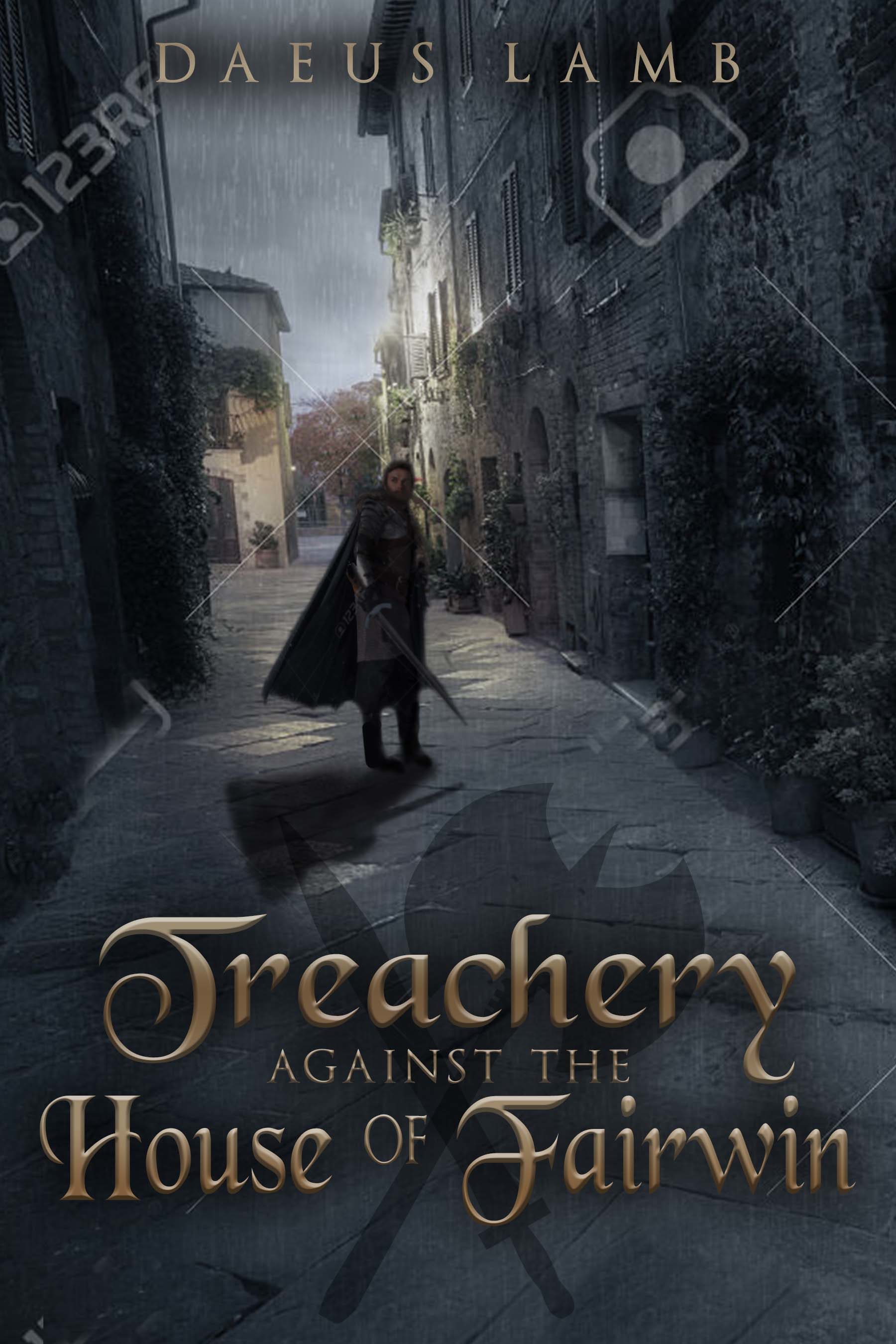
Can’t wait to see the finished art!January 5, 2017 at 2:56 am #23778@daeus The man’s face does seem rather blurry. Is there a way to fix that? Otherwise, I really like it.
January 5, 2017 at 7:40 am #23779@sarah-h I think that’s just temporary. This version doesn’t have the graphic quality the last one will have.
🐢🐢🐢🐢🐢🐢🐢🐢🐢🐢🐢🐢🐢🐢🐢🐢🐢🐢🐢🐢🐢🐢
January 7, 2017 at 1:47 am #23842@daeus Oh, okay.
January 12, 2017 at 7:39 pm #24355Ok, watcha think of this?
🐢🐢🐢🐢🐢🐢🐢🐢🐢🐢🐢🐢🐢🐢🐢🐢🐢🐢🐢🐢🐢🐢
January 12, 2017 at 7:57 pm #24357@Daeus I love it. Nothing really to complain of that I can see. I do think the picture of the man is a little fuzzy, but that may be just the distraction of all the watermarks and such on the cover. I love the crossed axe and sword. Overall, I find it very eye-catching and engaging.
@kate-flournoy Ah, good. The sword and axe was the main thing I wanted an opinion on. Also, it just came to my mind that the name might actually look better a little larger. I normally like them small, but I feel like a small increase would give it a more balanced feel. You think that’s right?
🐢🐢🐢🐢🐢🐢🐢🐢🐢🐢🐢🐢🐢🐢🐢🐢🐢🐢🐢🐢🐢🐢
January 12, 2017 at 8:10 pm #24361Yes, now that you mention it the name probably should be bigger. Not huge, but bigger than it is. I’ve a new appreciation for the size of names on covers after spending fifteen minutes at the library just examining covers… it was shocking how many titles were squished into the corner just to make room for a gargantuan name. :/ Anyway. Yes. I think it probably could be a little bigger.
-
AuthorPosts


- You must be logged in to reply to this topic.