Home Page › Forums › Other Art Forms › Art › Book Cover Opinions
- This topic has 30 replies, 11 voices, and was last updated 7 years, 3 months ago by
 Daeus.
-
AuthorPosts
-
December 29, 2016 at 5:40 pm #23394
Hello everybody,
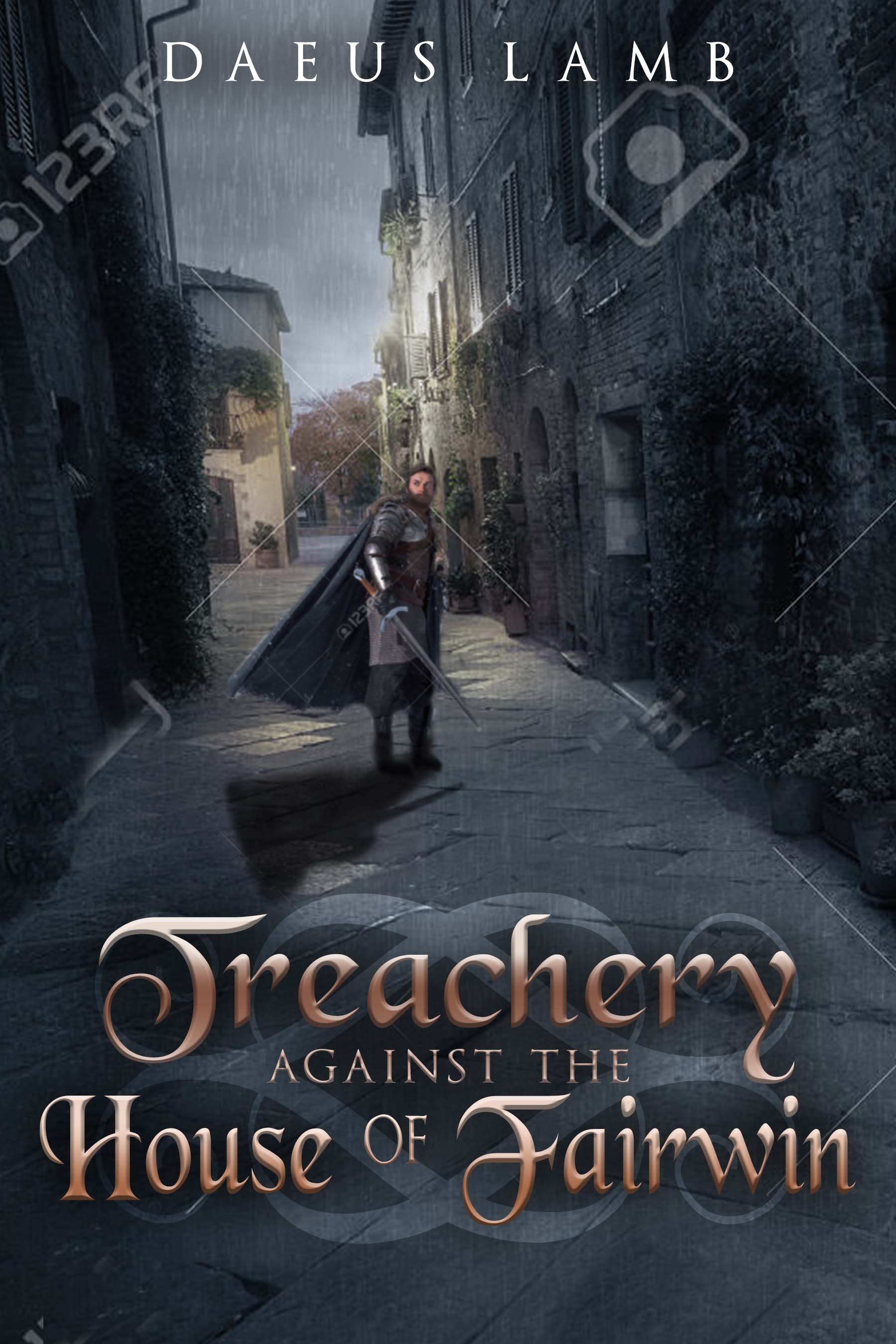
I’m working on getting a book cover designed at the moment, and I wanted to see what your thoughts were on it. My personal thoughts at the moment are that I’d like the font to be richer, somewhat goldish though also with a bit of brownish-copper. I’m also thinking of having my name be the same color. My other thought is that I’d like to see if the designer can put little furrows in the guy’s brow (I think she can do that). The one thing I’m not sure about is the little pattern thingy underneath the title. I don’t think it looks bad, but I feel like it’s not the best it can be. Do you have any ideas on how it could be improved or different patterns or symbols that could be used?
Here’s the link to the image:
https://files.podio.com/280599110
I’ll go ahead and tag some people @gretald @winter-rose @jess @kate-flournoy @emma-flournoy @christi-eaton @ethryndal @watersnail @aella @hope
🐢🐢🐢🐢🐢🐢🐢🐢🐢🐢🐢🐢🐢🐢🐢🐢🐢🐢🐢🐢🐢🐢
December 29, 2016 at 5:42 pm #23395Oh, by the way, the image isn’t the full resolution it will be and the clearish lines and stuff will be removed when the design is done.
🐢🐢🐢🐢🐢🐢🐢🐢🐢🐢🐢🐢🐢🐢🐢🐢🐢🐢🐢🐢🐢🐢
December 29, 2016 at 5:59 pm #23396@Daeus, is there a way you can put the cover image itself in a post? I can’t go to it by the link because it wants me to log in.
I understand dilemmas with covers, though. My sister and I are working on one right now and we keep running into things.December 29, 2016 at 6:15 pm #23397December 29, 2016 at 6:20 pm #23401Aha! It worked.
🐢🐢🐢🐢🐢🐢🐢🐢🐢🐢🐢🐢🐢🐢🐢🐢🐢🐢🐢🐢🐢🐢
December 29, 2016 at 7:02 pm #23405I agree with getting your name the same color as the title. And I think the fonts should match better. Your name isn’t going to be fancy like the title, but they just seem mismatched right now. It would be cool if the pattern thing could be a symbol from the book, but I’m not sure if there are any overt symbols in your book…
And one picky note… it is raining, but the ground doesn’t seem to be wet. It could help with the mood and all if there were puddles and such.
INTJ - Inhumane. No-feelings. Terrible. Judgment and doom on everyone.
December 29, 2016 at 7:18 pm #23407Anonymous
- Rank: Eccentric Mentor
- Total Posts: 1486
@Daeus Cool! All I’d say is I don’t necessarily like the title fount (Your name fount is good, and I like it without color). The guy looks a tad stiff, but I think the rain and the placement of the buildings is a nice touch. The lighting looks good too. I’m not sure about changing the pattern under the words; perhaps thinner, closer spaced lines would improve it, if that makes sense.
December 29, 2016 at 7:31 pm #23408@Daeus oohhh, I really like it. I would say yes, probably better to get your name matching the title. Also, a bit more technical piece of criticism here… my inner graphic designer is screaming at me that there should be more motion in the picture. It’s a lovely dramatic picture (love the shadows of the houses and such) but a lot more could be done with the rain. Puddles, as @Hope said, but it might also help to have the rain driving a bit more sideways. Gives more the impression of excitement; drama— violence almost.
Also, his boots seem to be very fuzzy and blurred… maybe that’s just the quality of the electronic viewing, but you might want to look into that.
But I do really love it even how it is— it fits the story very well. 😀
@Daeus That is cool. Those buildings! I love them.
I think your name would look better the same sort of color as the title, but darker; and also what Hope said—the fonts do look a little mismatched.
Though actually…I think it’ll be great once you change the name color, without changing the font.
And the stuff about the rain too.The title words look fake to me; just kind of…I dunno, plastic-y? But you said you’re thinking of changing the color, right; so if it’ll be darker I think that would help.
Also the guy’s cloak looks fake—too stretched out and stiff, when he’s in an alley and there can’t be much wind, or at least isn’t, since the rain’s not sideways.The symbol under the title is really neat but I think looks slightly off because it and the font over it are both swirly, and they don’t match. So maybe a straighter, more angular design would be better. (Something more Dwarvish than Elvish, if you get my drift. 😛 ) As long as it wouldn’t look bad against the angular paving stones…
The biggest thing is just the slightly cheesy looking title words, and I think making them darker would help quite a bit.
That’s a seriously neat cover though.
Oh, and I can’t see the guy’s face well, but how I can looks like he’s already got a furrow in his brow.December 29, 2016 at 8:26 pm #23412Thanks everybody! Great comments.
@winter-rose @emma-flournoy I think the main problem with the font is definitely the color, though I think you might be right in saying the font could be better too.
So if you were to choose a different font, what would it look like?
🐢🐢🐢🐢🐢🐢🐢🐢🐢🐢🐢🐢🐢🐢🐢🐢🐢🐢🐢🐢🐢🐢
December 29, 2016 at 9:46 pm #23427@daeus I like it, I don’t have much to add outside of everyone else’s comments, I’d say just experiment with what they pointed out then bring it back for us to look at. 😉
Theater kid. Currently depressed because I can't stop listening to sad musicals.
December 29, 2016 at 9:48 pm #23428Also @daeus, a deep red might look cool in your name and title.
Theater kid. Currently depressed because I can't stop listening to sad musicals.
December 29, 2016 at 9:49 pm #23429Ah, yes, I was thinking a redish-gold actually.
🐢🐢🐢🐢🐢🐢🐢🐢🐢🐢🐢🐢🐢🐢🐢🐢🐢🐢🐢🐢🐢🐢
December 29, 2016 at 10:15 pm #23430@daeus I think the picture is really neat, with the deep dramatic shadows, I just don’t like the title font too much. Like Emma said, it kind of seems plastic. I think maybe if it were a little more aged and worn looking, it might fit better. Also, I thought the design behind it almost looks like it’s part of the road, though I’m not really sure what you could do about that.
-
This reply was modified 7 years, 3 months ago by
 Ethryndal.
INTJ ➸Your friendly neighborhood mastermind. ➸https://thesarcasticelf.wordpress.com/
December 30, 2016 at 5:06 am #23433Overall it’s pretty cool. Here is what I noticed in order.
–That’s cool looking. A medieval guy in an 19th century setting.
–Wait, is this supposed to be a medieval guy in a medieval setting? It doesn’t seem like it. Oh well.
–Seems like a thriller. Although most thrillers have a back shot. Not a front shot.
–The guy looks very photoshopped. Why?
–I think it’s the fact that he’s not clear.
–What’s his face like? Never mind he’s too blurry.
–I know why it looks fake! It’s the lighting. There doesn’t seem to be any light that is lighting up his face. All the light is behind him.
–Nice sword.
–Let me take a look at the words. It looks fine. Title is a little hard to read though.
–Nice symbol behind the title.
–There are no puddles on the ground even though it’s raining.
–What is he looking at? A person. Me? A house? Why is he doing that?
–Okay. Let me type all this down.I blog on story and spiritual things at mkami.weebly.com
-
AuthorPosts


- You must be logged in to reply to this topic.