Home Page › Forums › Other Art Forms › Art › Book Cover Opinions #2
- This topic has 96 replies, 14 voices, and was last updated 7 years, 2 months ago by
 Rolena Hatfield.
-
AuthorPosts
-
January 17, 2017 at 12:55 am #24529
@Daeus Maybe it doesn’t matter, but the young man on the cover looks very modern-day. The book takes place during the Rennaisance, right?
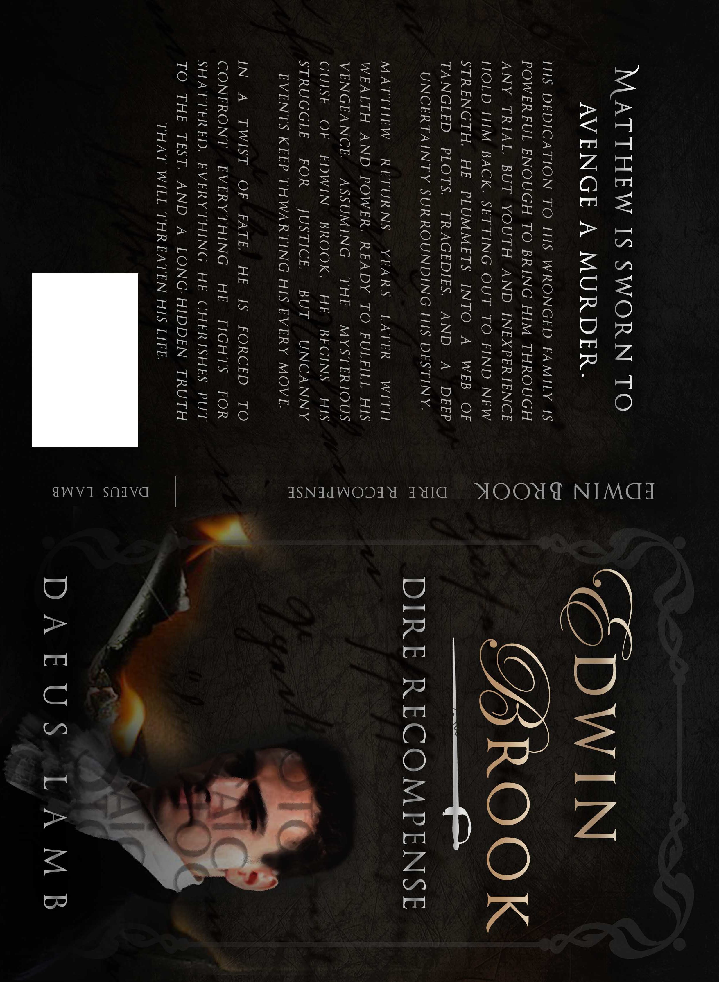
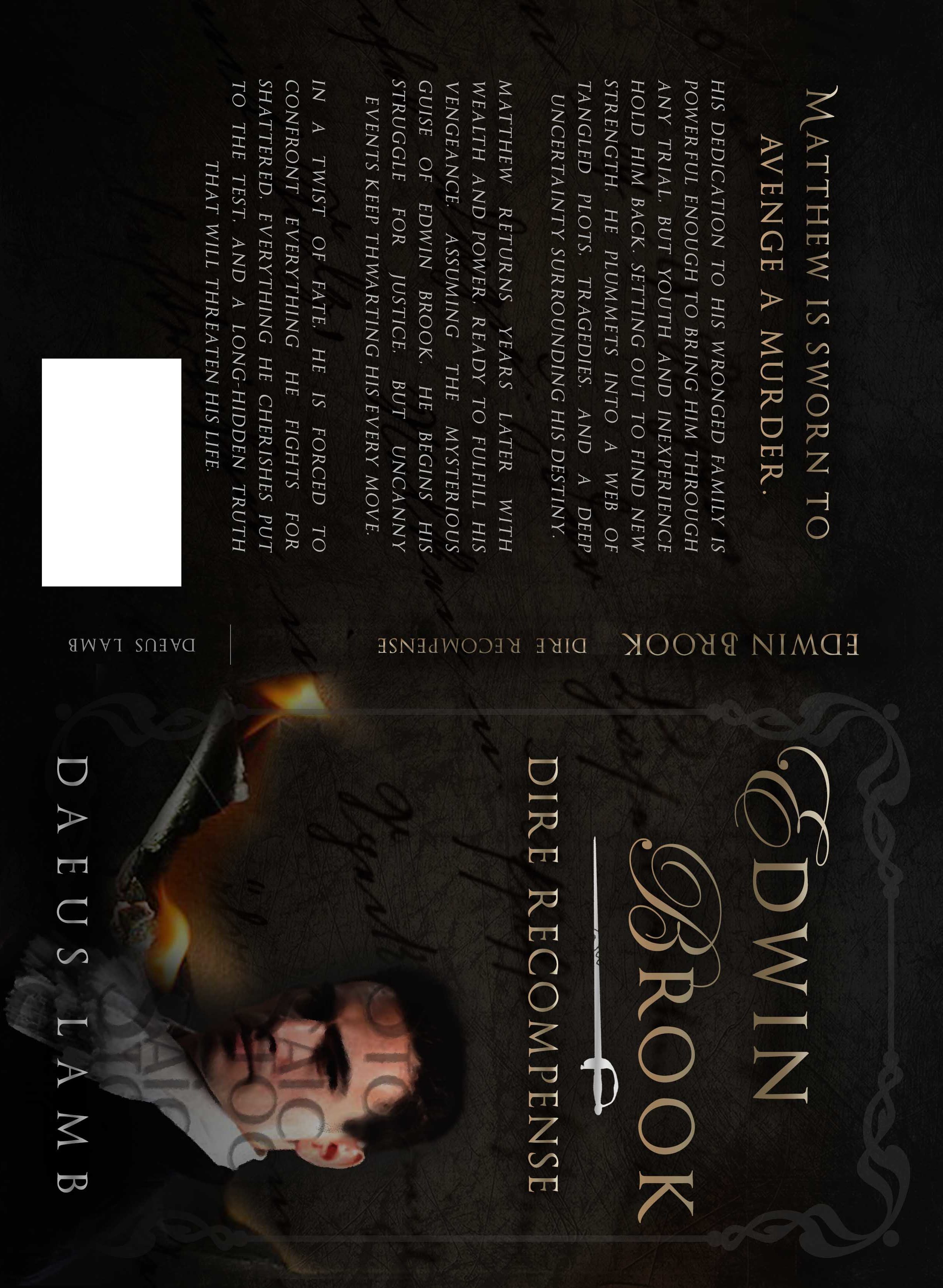
January 17, 2017 at 6:58 am #24530@sarah-h Enlightenment age, actually. I know what you mean though. He’s not quite perfect for his era, but his outfit actually is fairly authentic. The big thing about the image is that it fits the character really well.
🐢🐢🐢🐢🐢🐢🐢🐢🐢🐢🐢🐢🐢🐢🐢🐢🐢🐢🐢🐢🐢🐢
January 17, 2017 at 7:28 pm #24553@Daeus those changes seriously helped it look more historical fictiony. It’s great.
I like the second one better, with the gleam on the words.
I think it might look better though if the gold was a little darker, whether you put it for the title or the subtitle, or with or without a gleam. It looks pretty similar to the silver.January 18, 2017 at 1:59 am #24578@Daeus This is so exciting! You’ve been working on Edwin Brook for as long as I’ve been on KP, and now it’s almost finished! How long do you think it will be until you publish it?
January 18, 2017 at 7:04 am #24581@sarah-h Um, about whenever my mom finishes her second edit + a week or two. 😉
🐢🐢🐢🐢🐢🐢🐢🐢🐢🐢🐢🐢🐢🐢🐢🐢🐢🐢🐢🐢🐢🐢
January 18, 2017 at 8:29 am #24586@kate-flournoy @emma-flournoy @anyone-else Ok, here’s with all silver and here’s with a gold title. I’m feeling like I liked it better with the silver title and gold subtitle, but I don’t think that was quite right either. Thoughts?

🐢🐢🐢🐢🐢🐢🐢🐢🐢🐢🐢🐢🐢🐢🐢🐢🐢🐢🐢🐢🐢🐢
January 18, 2017 at 4:45 pm #24621@daeus I’ve been stalking this topic for a while now and thought I’d jump in real quick 🙂 The cover is turning out amazing! Congrats!
Personally I really like the gold title with silver sub-title because it sets the title apart from the rest of the words on the front. But I can’t make up my mind weather I like Edwin’s name in gold or silver better.https://rolenahatfield.com/
January 18, 2017 at 7:42 pm #24633@Daeus I like the one with the gold title better, but if it could have a little darker sheen that would be great. 😀 The sheen on the silver title’s darker and shadowy-er and so shivery mysterious feeling, but like Rolena said, the gold stands out better.
January 18, 2017 at 8:03 pm #24634@emma-flournoy That’s what I’m thinking. Say, do you think it might look better if the subtitle were gold too?
🐢🐢🐢🐢🐢🐢🐢🐢🐢🐢🐢🐢🐢🐢🐢🐢🐢🐢🐢🐢🐢🐢
January 18, 2017 at 9:36 pm #24638@Daeus Hm…it might. Wouldn’t hurt to try and see, at any rate. 😀 And the silver sword between would make a nice divider.
January 18, 2017 at 9:48 pm #24639@Daeus I’m late, but the gold title definitely works better.
Ok, this is what we’re at now. I personally like it with the silver subtitle better, but I’m thinking it might be good to make the name gold. (There’s now a shadowed effect on the title like you said, @emma-flournoy) Any thoughts?

🐢🐢🐢🐢🐢🐢🐢🐢🐢🐢🐢🐢🐢🐢🐢🐢🐢🐢🐢🐢🐢🐢
January 19, 2017 at 9:09 pm #24683@Daeus I like it. A lot. I would tend to agree that the silver subtitle does look best.
@Daeus I like it with the silver subtitle, too.
January 20, 2017 at 1:53 pm #24726Ok, Here’s the same thing only with the name in gold. Any votes between the gold and silver name? @kate-flournoy @emma-flournoy @dragon-snapper @rolena-hatfield @sarha-h

🐢🐢🐢🐢🐢🐢🐢🐢🐢🐢🐢🐢🐢🐢🐢🐢🐢🐢🐢🐢🐢🐢
-
AuthorPosts


- You must be logged in to reply to this topic.