Home Page › Forums › Other Art Forms › Art › Book Cover Opinions #2
- This topic has 96 replies, 14 voices, and was last updated 7 years, 2 months ago by
 Rolena Hatfield.
-
AuthorPosts
-
January 12, 2017 at 9:10 pm #24364
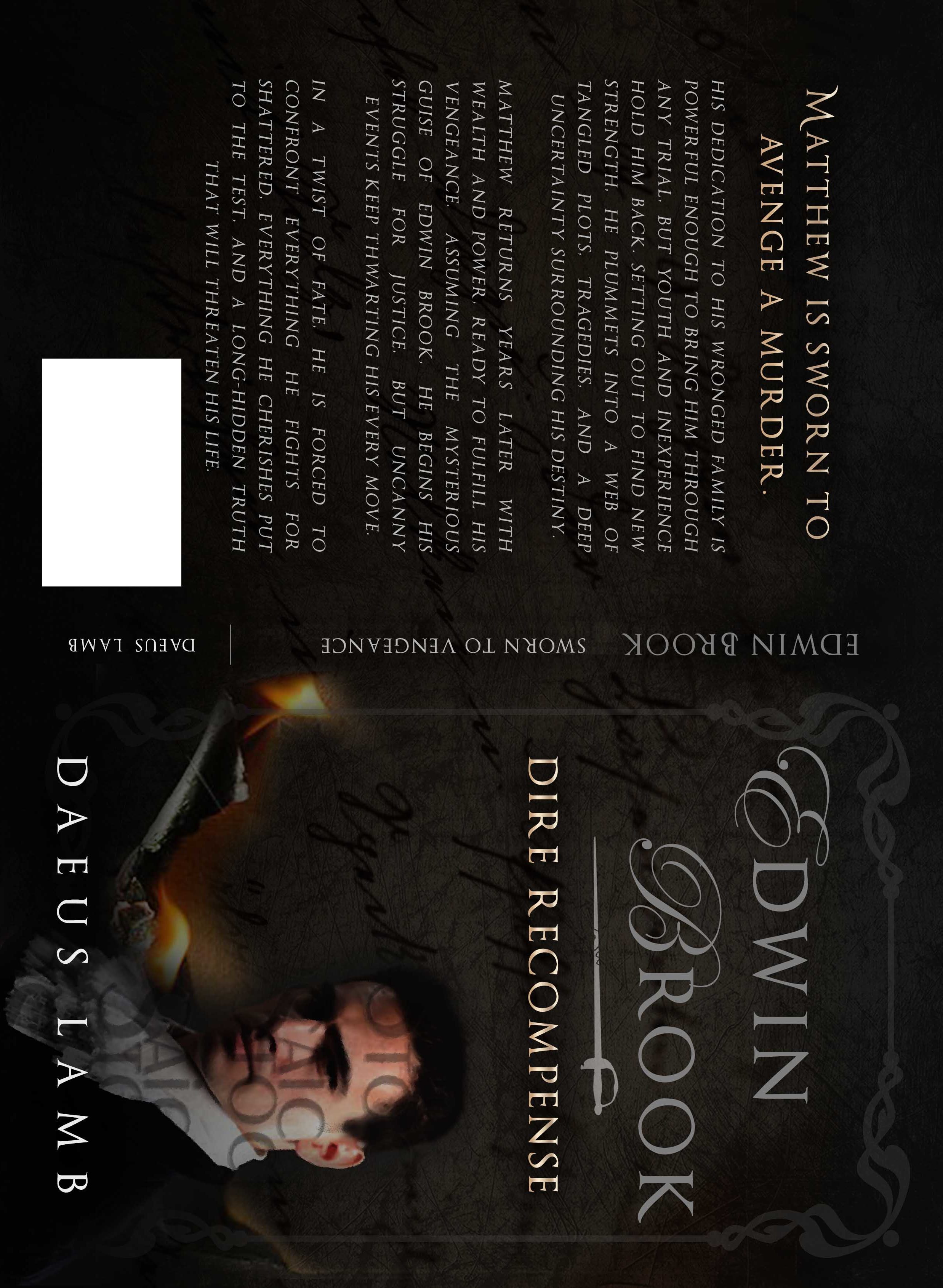
@emma-flournoy Thanks. Do you mean the whole cover, or just Edwin should be less dark?
Here’s another question for y’all. Do you think I should change the scarlet font to a different color? I think that might do a lot to give it a more historical action, less murder story feel. If so, any suggestions? Gold maybe?
🐢🐢🐢🐢🐢🐢🐢🐢🐢🐢🐢🐢🐢🐢🐢🐢🐢🐢🐢🐢🐢🐢
January 12, 2017 at 9:31 pm #24365@Daeus I meant the whole cover, though if you lighten that up you might have to lighten him up a little too. I love his outfit though, and I don’t think the stern look is bad, unless he’s not a very hard character. (I got the impression he was. 😉 )
And I think changing the scarlet font would help a lot. I guess, red and black…that color combo just goes with murder for some reason. 😛
Gold might work, as long as it won’t clash with the fire on the letter; some sort of middle-shade brown might work well too.
But yeah, some earthier/more natural color I think’ll go quite a bit towards making it give the impression you want.January 12, 2017 at 11:54 pm #24366@Daeus, I agree with everyone else. If the name was moved down, and the title up would definitely help with cramped space. I did get a little bit of the murder-ish feeling from looking at it, but changing the scarlet color would help a lot, in my opinion. I would go with an earthier color too.
January 13, 2017 at 2:56 am #24367@daeus I really like the cursivy letters on the parchment, but I don’t like the letters in Edwin’s face. Is there a reason for them?
January 13, 2017 at 6:30 am #24368@Sarah-H I think they’re copyright markings for until the cover’s finished, so no one can steal it.
Yep, Kate’s right. Don’t worry. It’s not the new style.
🐢🐢🐢🐢🐢🐢🐢🐢🐢🐢🐢🐢🐢🐢🐢🐢🐢🐢🐢🐢🐢🐢
January 13, 2017 at 1:34 pm #24389Alrighty friends, now see if you can help me with a subtitle here. I’ve got a couple ideas, and I want to see what strikes your interest the most. Pick your top four, as long as that many actually catch your attention.
If you haven’t seen the cover yet, look one page back on this topic. It should be a bit cleaner when done and have a stronger historical action feel, but I think that’s basically what it’s gonna be like. So what stands out to you?
Edwin Brook: Dire Recompense
Edwin Brook: The Call of Justice
Edwin Brook: Justly Rewarded
Edwin Brook: A Tale of Justice
Edwin Brook: Rewarded Justly
Edwin Brook: Total Recompense
Edwin Brook: Final Recompense🐢🐢🐢🐢🐢🐢🐢🐢🐢🐢🐢🐢🐢🐢🐢🐢🐢🐢🐢🐢🐢🐢
January 13, 2017 at 1:49 pm #243981. Edwin Brook: Final Recompense
2. Edwin Brook: The Call of Justice (I dunno, might take out the “the”)
3. Edwin Brook: Dire Recompense
4. Edwin Brook: A Tale of Justice (though I don’t care too much for this one…)January 14, 2017 at 2:32 am #24434@kate-flournoy Oh, phew. Thank you.
@daeus Well, I actually like the subtitle on the cover, Sworn to Vengeance, best. Of the list, Final Recompence sounds cool, but it doesn’t really seem to fit with the theme the same way. Call of Justice would be second in line, but “justice” gives the story a different feel from “vengeance”, which seems to be more accurate. Am I making any sense? I really do like Sworn to Vengeance. I haven’t read the story yet, but from what I’ve heard of it, it seems to fit perfectly. Is there a reason it didn’t make it on the list?January 14, 2017 at 2:41 am #24435@Daeus One of the Recompense ones (probably Dire Recompense) because the other ones sound very cliche and unoriginal IMO
I blog on story and spiritual things at mkami.weebly.com
January 14, 2017 at 7:50 am #24436Ok, I’ve decided to go with Dire Recompense.
@sarah-h I really liked the subtitle too. I just had to consider the Christian audience. I’m not targeting specifically to them, but I still don’t want to deter them. For me, a vengeance story is attractive, but if I don’t know anything about the author, it would make me extra skeptical. Dire Recompense also has a deeper meaning to it if you’ve read the book.🐢🐢🐢🐢🐢🐢🐢🐢🐢🐢🐢🐢🐢🐢🐢🐢🐢🐢🐢🐢🐢🐢
January 14, 2017 at 12:48 pm #24446@Daeus Neato. I really liked Sworn to Vengeance too, but I know what you’re saying.
Dire Recompense is sure nicely original.
January 14, 2017 at 2:56 pm #24454Ok, this is what it looks like with the adjustments. The only exception is, for some reason, my designer made the name white. I think I’ll ask here if she can change it back to silver.
Other than that, my only thought is that possibly the silver could be just slightly flashier, but not much cause I like the shade. Any ideas?
🐢🐢🐢🐢🐢🐢🐢🐢🐢🐢🐢🐢🐢🐢🐢🐢🐢🐢🐢🐢🐢🐢
January 16, 2017 at 7:24 pm #24524@kate-flournoy @anyone-else
I thought perhaps the silver might be better with a slight gleam, so this is what that looks like. I feel like I liked it better before. One option which might work, but I don’t feel is right would be to make the subtitle silver too. Perhaps I could make the title the current gold and the subtitle the current silver. Any thoughts?

🐢🐢🐢🐢🐢🐢🐢🐢🐢🐢🐢🐢🐢🐢🐢🐢🐢🐢🐢🐢🐢🐢
January 16, 2017 at 7:29 pm #24525@Daeus hmmm… I like the silver… at any rate the gradient gives the words a bit more of a mysterious look. I’m not sure it’s such a great idea to have both gold and silver words in the same place, unless you were gonna make the title gold and the subtitle silver, because gold is so much more vibrant it’s very distracting. If you’re going to have gold it should be the title, though I think both in silver would look just as nice, maybe nicer.
Love the sword, btw. 🙂
-
AuthorPosts


- You must be logged in to reply to this topic.