
Home Page › Forums › Other Art Forms › Art › Book Cover Opinions #2
- This topic has 96 replies, 14 voices, and was last updated 7 years, 2 months ago by
 Rolena Hatfield.
-
AuthorPosts
-
December 29, 2016 at 9:46 pm #23426
Aesthetically, I think it works well. I appreciate the opacity as it is. If it were more faded, it may be a distraction because the viewer would have to look closely at it to figure out what it is, and any less fade would be an eyesore.
December 29, 2016 at 10:24 pm #23432@daeus I had to scrutinize it very closely to figure out that he’s holding a cane. At first glance, it looks like some strange kind of shoe or something. Also, the red lettering doesn’t seem to stand out very well, though I would be careful if you brighten it, because you don’t want it to look like Santa Claus’s coat. I think the hand with the locket is good because it balances everything and doesn’t make the cover look lopsided. I would love to comment on the girl’s age, BUT I still can’t find where she is, so…yeah. Though no one else seems to be having a problem with that, so I’m just going to assume that it’s either my computer, or my eyes. 🙂
INTJ ➸Your friendly neighborhood mastermind. ➸https://thesarcasticelf.wordpress.com/
December 30, 2016 at 5:08 am #23434I’m sorry, man. But it looks like a romance. Despite the title.
I blog on story and spiritual things at mkami.weebly.com
December 30, 2016 at 7:16 am #23435@Daeus here I am! Returned from the dead!
*dives into critic-mode* Okay, I like it? First problem is it doesn’t fit the genre. Not sure it quite looks like a romance, but it doesn’t really fit the story. Some of that may be because of the boring brick wall but you said that’s going, so… yeah. For an action/adventure though it’s too calm and mysterious. It almost looks… *winces* melodramatic? And I’m really, really sorry, but at first glance the cover looks like a book about vampires. The dark, mysterious man, and then the red subtitle… if you just passingly glance over it without taking time to read, it practically screams vampire. To me at least. I wouldn’t know, but that’s my impression.
Also what is he holding? It looks… I’m not even sure what it looks like. Some weird kind of metal shoe? 😛
And now the inner graphic-designer comes out… it’s not a very clever cover. The best covers tell a story all their own, not simply contain elements of the story inside. You’d be shocked what can be done with the placement of the figures and the mixing/blending of different pictures for different affects. Even drab colors can be gotten away with if the cover is clever. Like this:
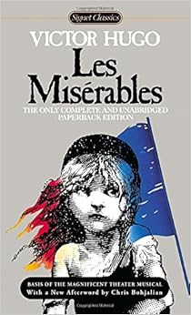
That’s a pretty simple cover— but the cleverness of imposing the flag (a flag all history-buffs instantly recognize) over the girl’s hair (not to mention the soul in the drawing of the little girl) gives your eyes something to play with— something to interest them besides just a picture. The flag without the girl wouldn’t work. Neither would the girl without the flag. But together they tell an entirely different story.
Also, the mark of a great cover isn’t necessarily how ‘real’ it looks. How much like a photograph. The cleverness of it is so much more important it’s not even funny.So I don’t necessarily dislike it, but I know you could do better.
@mark-kamibaya Ahgh! That’s just what I don’t want!
@kate-flournoy Vampires. Ugh. That’s why I didn’t like the girl’s affect. You’re right. *grimaces*So I’m gonna try to reimagine this cover. I like the guy, but maybe something else needs to change. Maybe even forget the guy? Who knows?
Now if any of you have any ideas, I’d gladly take them, because this cover’s racking my brains.
@kate-flournoy @hope @his-instrument ideas for how to weave a story into it?🐢🐢🐢🐢🐢🐢🐢🐢🐢🐢🐢🐢🐢🐢🐢🐢🐢🐢🐢🐢🐢🐢
December 30, 2016 at 8:00 am #23438@mark-kamibaya Do you think it’s because of the girl, or would it look that way even if I took the girl out and added something to make it look more literary or actiony?
🐢🐢🐢🐢🐢🐢🐢🐢🐢🐢🐢🐢🐢🐢🐢🐢🐢🐢🐢🐢🐢🐢
December 30, 2016 at 8:20 am #23439@kate-flournoy So here’s the best idea I’ve come up with so far. You know that letter he wrote to his sister then burned in the fire? What if I were to show that on the top (as an actual letter of course) and then have the flames licking it from the bottom and a black at the bottom of the page that mostly shrouds Edwin until it morphs into the flames and the letter?
Thoughts?
🐢🐢🐢🐢🐢🐢🐢🐢🐢🐢🐢🐢🐢🐢🐢🐢🐢🐢🐢🐢🐢🐢
December 30, 2016 at 8:53 am #23440Ok, here’s a note. The themes of this book are.
Justice
Destiny
LovePretty much in that order too. Now here’s the #1 impression I want to make with the cover. I want to make it seem like the character is struggling over some issue, important choice, or haunting past.
🐢🐢🐢🐢🐢🐢🐢🐢🐢🐢🐢🐢🐢🐢🐢🐢🐢🐢🐢🐢🐢🐢
December 30, 2016 at 9:48 am #23441@daeus Just a thing about that guy (who I’m assuming is Edwin Brooke)…at first glance it looks as if he is holding an axe, not a cane. (or is it even a cane) And I also am not sure about all the faded letters in his face.
☀ ☀ ☀ ENFP ☀ ☀ ☀
December 30, 2016 at 9:49 am #23442@daeus If he is struggling with something, he could be pouring over a book on a desk, his head in his hands.
☀ ☀ ☀ ENFP ☀ ☀ ☀
December 30, 2016 at 10:01 am #23443Thanks, @dragon-snapper. The letter over his face will be removed when the design is done.
Here’s another idea I just had. What if I could get a crack going down the center. On the right side I could keep it black, but on the left side I could make it white. Perhaps the font would be adjusted to fit that. I don’t know. I would like to put something on the white side that has some symbolism from the story (something that would fit well on the bright sid). @kate-flournoy, do you have any ideas. (Hey, you’re the one who told me to be pestering.) I’ve thought about a hangman’s noose. Possibly Emma at four-ish. Any other ideas?
🐢🐢🐢🐢🐢🐢🐢🐢🐢🐢🐢🐢🐢🐢🐢🐢🐢🐢🐢🐢🐢🐢
December 30, 2016 at 10:16 am #23444Oh yeah…heh. 😛 @daeus
Well, I kinda like the black and white idea, but I would be warned to make it readable. I don’t know what your thinking of, but what I have in my head is hard to read. And are you planning on keeping the guy in addition to the noose and the girl?? or would you loose one of them. All three of those would look cluttered. I actually feel a little cluttered with the girl even now.☀ ☀ ☀ ENFP ☀ ☀ ☀
December 30, 2016 at 10:24 am #23445@dragon-snapper Oh, yeah. The girl would be nixed.
Here’s another idea I had. What if I had the guy without his cane thingy (a little more zoomed up on his face) and then put him at the very bottom of the page with flames licking around him and then transitioned into a plain white and made the font more prominent. (in which case I would also replace the line between the title and subtitle with a sword or pistol.)
🐢🐢🐢🐢🐢🐢🐢🐢🐢🐢🐢🐢🐢🐢🐢🐢🐢🐢🐢🐢🐢🐢
December 30, 2016 at 10:46 am #23446Ok, folks.
So while we’re here, I thought I’d share a lesson I just learned about book covers. I went throughout our house and looked at all the novels we have then went and browsed the classics section on amazon. Here’s what I learned about what makes a good book cover.
#1 It’s simple. You don’t have to study it, you understand everything about it in a split second.
#2 It’s bold.
#3 There’s something that makes you ask a question. It’s just like the hook in an opening line. You want one small but prominent little detail that makes you curious. For instance, you could have a very basic cover, but there’s a shadow of a man cast across it. That makes you ask, “Who is the man?”🐢🐢🐢🐢🐢🐢🐢🐢🐢🐢🐢🐢🐢🐢🐢🐢🐢🐢🐢🐢🐢🐢
-
AuthorPosts


- You must be logged in to reply to this topic.