Home Page › Forums › Other Art Forms › Art › Another Book Cover!
Tagged: Aquila, Art, Blender, Book Cover, CG, Compositor, Cover Art, Cycles
- This topic has 27 replies, 10 voices, and was last updated 7 years, 2 months ago by
 ClaireC.
-
AuthorPosts
-
January 21, 2017 at 2:42 pm #24783
@Leumeister I know this is SO helpful, but, pretty much what everyone else said. 😛 Especially about the need for a question.
And do you mean, can we tell the character on the left is a girl? I think that’s what you meant. That ‘left’ made you write ‘right’. 😛
I can tell, since you mentioned it, but I might be unsure if I didn’t know.January 21, 2017 at 2:59 pm #24787@leumeister Hmm… I feel like I liked 1.1 better actually. In my opinion, the title was right how you had it before. As for the characters, there might some way to make them work, but I’m thinking now that you might have an easier time of it not worrying about them. I know, that sounds radical, but it’s going to be hard to fit them on there in a way that will really look awesome (good isn’t good enough). That would leave your cover looking pretty simple, but here’s two things to consider.
1. The best covers are actually very simple. After looking through a bunch of covers, I’ve concluded that the best cover I’ve ever come across is this one.https://www.amazon.com/Animal-farm-Fairy-George-Orwell/dp/0451526341/ref=sr_1_1?ie=UTF8&qid=1485028530&sr=8-1&keywords=animal+farm
2. You can still add some details, just simpler ones. My one thought is that right below the title you could put some planet, star, space station, or other object they are leaving. That would ask the question, “Why are they leaving?”🐢🐢🐢🐢🐢🐢🐢🐢🐢🐢🐢🐢🐢🐢🐢🐢🐢🐢🐢🐢🐢🐢
January 21, 2017 at 10:00 pm #24813Actually, I meant to write, “Can you tell that the character on the right is a girl”? 😛 Good grief, my mind was working well that time. Not! 😛
Oh, okay. I think I might try something completely different now…
Also, @2, I think that might be overdoing it. :/ IDK. I’ve got another idea that the Animal Farm cover inspired, so I’ll give that a go.
January 21, 2017 at 10:25 pm #24816Here’s an alternate cover idea.
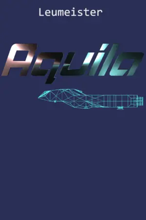
I’ll be honest, I don’t like it as much as the others, but if I just change the layout a little, add, perhaps, the dimensions of the ship, it may look pretty good. It’s just an idea I have.
January 21, 2017 at 11:42 pm #24818“Can you tell that the character on the right is a girl”?
@leumeister I kind of had it backwards and thought the character on the left was a girl and the one on the right was a boy. Merp.I think cover 2 has possibilities, though I think the title is slightly too big. It kind of looks like it’s falling off the page. And about the Cover 1, what I meant by saying the people were walking in space is that, obviously (unless they have super good technology in your galaxy) people can’t be in space period, because a number of bad things, which I won’t go into here for the sake of time, would happen to them. 😛 Maybe this is just because it’s not really polished yet, but it almost seemed to me like the people were actually running through space, with a big spaceship chasing them. :/ But if you go with Cover 2, that won’t be a problem anymore. 🙂
INTJ ➸Your friendly neighborhood mastermind. ➸https://thesarcasticelf.wordpress.com/
January 22, 2017 at 12:21 am #24822They weren’t running through space. It was kind of an overlay of the characters, pasted over the top of the main ship in FTL travel. I’ve seen it implemented in other places, and I thought it would be a good style on the cover. They actually fade into the background a little, as if to say, “They’re not actually there…” Perhaps I need to accentuate that a little more.
January 22, 2017 at 8:51 am #24823@leumeister For version 3.0 with the purple cover, I kinda like the ship blueprint, but overall the previous versions were much better. 1. They were more balanced. 2. They looked more spacey. 3. There was motion. 4. There was a focal point.
🐢🐢🐢🐢🐢🐢🐢🐢🐢🐢🐢🐢🐢🐢🐢🐢🐢🐢🐢🐢🐢🐢
January 22, 2017 at 9:07 am #24824Yeah, I think I might go back to the other style. Version 1.2.1 (the branch for 1.2 :P) I thought looked a little too plain. But hey! An artists’ work is never done, it’s only finished when he’s completely satisfied with it. ^_^
January 22, 2017 at 1:29 pm #24825It was kind of an overlay of the characters, pasted over the top of the main ship in FTL travel. I’ve seen it implemented in other places, and I thought it would be a good style on the cover. They actually fade into the background a little, as if to say, “They’re not actually there…” Perhaps I need to accentuate that a little more.
@leumeister Like I said, it’s only a rough draft, and when you polish it up, it will probably look fine.INTJ ➸Your friendly neighborhood mastermind. ➸https://thesarcasticelf.wordpress.com/
January 23, 2017 at 2:23 am #24834Yeah, you’re right. 🙂 I’ll probably work on it on and off for a little bit.
February 2, 2017 at 4:48 am #25326@leumeister, I’m definitely not an authority on sci-fi, So all I can say is that it looks pretty good to me. 🙂
Official Member of the Certified Club of Aussie Kapeefers
February 2, 2017 at 5:03 am #25329Thank you! 😀 Anything you would want me to change or add?
February 14, 2017 at 4:50 am #25786@leumeister, ummmmmmmmm…I don’t think so. It looks pretty good to me. I probably like the second one best.
Official Member of the Certified Club of Aussie Kapeefers
-
AuthorPosts

- You must be logged in to reply to this topic.