Home Page › Forums › Other Art Forms › Art › Another Book Cover!
Tagged: Aquila, Art, Blender, Book Cover, CG, Compositor, Cover Art, Cycles
- This topic has 27 replies, 10 voices, and was last updated 7 years, 2 months ago by
 ClaireC.
-
AuthorPosts
-
January 20, 2017 at 5:47 am #24691
@daeus @perfectfifths @natalie-marie @kate-flournoy @emma-flournoy @ethryndal @dragon-snapper @bluejay @rebelutionary @jess @hannah-krynicki @sarah-h @gretald @rolena-hatfield @clairec @winter-rose
Hi guys!
Yeah, it’s a book cover topic. 😛 But I want to share this.
But before I do, I have to tell you that…
THIS IS JUST THE LAYOUT/MOCKUP DESIGN. THE FINAL VERSION WILL HAVE A BETTER MODELED AND TEXTURED SHIP, AND HUMAN CHARACTER MODELS…But the logo I’ll probably keep. 😛
Anyway, here it is!
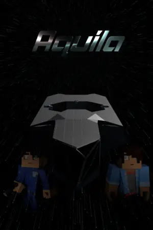
What do you think? Any comments, critiques, or commendations? ^_^
-
This topic was modified 7 years, 3 months ago by
 Leumeister.
January 20, 2017 at 5:53 am #24693Oops… I got the tags for Natalie and Grace W. wrong…
January 20, 2017 at 7:11 am #24694@Leumeister I love the title, though it might be a little too metallic to show up well against your background, and as far as I can tell with your experimental models, the actual cover looks like it’ll be well laid out. It does seem a bit too dark though, and besides that maybe a little uniform. There’s nothing really eye-catching about the cover itself— it doesn’t ‘pop’, if that makes any sense. The colors are all similar shades; there’s no contrast. I wouldn’t go wild with the colors, but I do think you need some variation. Maybe a brighter blue, and depending on what mood you’re going for, you could also make the background look more ‘space-y’. Galaxies or something.
@leumeister Ooh…Ahh… I love the font, and the metallic feel of it. Very spacey. Though the cover is quite dark; the shading in contrast again the stars is hard to make out. I wasn’t sure at first it was a spaceship, but if it were lighter, I probably could.
☀ ☀ ☀ ENFP ☀ ☀ ☀
January 20, 2017 at 8:10 am #24698@leumeister My main thought is to accent the stars more. First of all, it looks like their focal point is on the title. I’m not an expert, but my impression is that a better focal point would be between the spaceship and the title. Also, I would make the light streams from the stars a lot more prominent. It would add motion and also draw eyes better. Now, at the same time, there’s a big risk of going overboard, so… don’t do that. Also, if you end up adding more elements, too much light might make it distracting. Anyways, play with it.
My only other thought is that it doesn’t ask a question. If a cover makes you ask, “why is it like that?” that’s the best cover. These are just some random ideas to show you what I mean; I doubt any of them would be what you want.
1. If there were two clashing flags at the top of the cover (and if they were flags that no one has ever seen before), that would invite a question.
2. If the spaceship looked like it was about to blow up, that would invite a question.
3. If you had the face of the story’s villain in the background, that would invite a question.And there are lots of other options.
🐢🐢🐢🐢🐢🐢🐢🐢🐢🐢🐢🐢🐢🐢🐢🐢🐢🐢🐢🐢🐢🐢
January 20, 2017 at 8:49 am #24703Well, I want to keep the font metallic… It just fits with the style of the story. Thanks, though! I’m glad it looks like it will work! ^_^ How do you think I could fix the uniformity of the cover? Also, did the logo’s reflections catch your eye?
Oh, and the ship is in FTL travel (a term I use a lot in Aquila!), so you wouldn’t really see the spaciness, because it’s all elongated blurs! XD 😛Yeah, I think I can get that. I’m working on brightening it up a bit, though, so hopefully it’ll look a little better. ^_^
Okay. This render I just cancelled (:P) had the stars lookin’ a little brighter – all I did was double their emission strength. ^_^ I also added a bit of motion blur to the ship, too. That does make it a little better!
… Wow… Just those minor improvements makes it look a lot more dramatic!! I’ll post version 1.1 when it’s done! 😀
- Flags… Perhaps emblems… I’ll have to think about that one.
- I’m not going to make the ship blow up! XD It’s the main ship! Well, at least… not yet…
- I don’t know… I actually considered it, but I found that was a little cliché…
What are other options you might suggest? =)
January 20, 2017 at 8:57 am #24704Okay, here’s book cover version 1.1
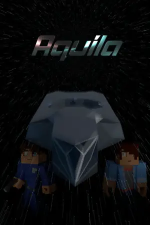
Version 2.0 will probably roll around when I have a better modeled ship and better character models. 😛
January 20, 2017 at 10:08 am #24705Anonymous
- Rank: Eccentric Mentor
- Total Posts: 1486
@leumeister I don’t have much to add to what everyone else said. The contrast in the 1.1 version is defiantly an improvement, and the font is nice. I agree with what @daeus said: the cover doesn’t make one ask questions.
January 20, 2017 at 11:32 am #24711@leumeister Yup, they’ve covered it! Version 1.1 is a huge improvement. I’d just add that if you want to use this as an e-book cover, you could probably make the text larger. Covers can be hard to read in a thumbnail Kindle library. Btw I love the textures and lighting; those were always the hardest bits for me when I dabbled in CGI. 🙂
January 20, 2017 at 12:19 pm #24712@Leumeister Weeeeeell, looks like everyone else has pretty much said my main thoughts, so, yeah. I do like the title font and the metallic quality of it. Looks spacey. And I know this is just a rough draft, but when you start to polish it up, I would just remember to do something with the people, so they don’t look like their walking around in space or something. 🙂
INTJ ➸Your friendly neighborhood mastermind. ➸https://thesarcasticelf.wordpress.com/
January 20, 2017 at 7:48 pm #24742@leumeister @daeus What if you made them running…? Would that give a question – like, what are they running from?
Currently reading Les Miserables
January 20, 2017 at 8:03 pm #24743@leumeister Now that you’ve added more to the spaceship, it seems to me that the characters might look a little squished down there at the bottom. My suggestion would be to move them up to the center side by side and make them in the background with fading. Working on their expressions could add that element of question if you do it right.
🐢🐢🐢🐢🐢🐢🐢🐢🐢🐢🐢🐢🐢🐢🐢🐢🐢🐢🐢🐢🐢🐢
January 20, 2017 at 8:40 pm #24748@winter-rose:
Okay. I’ll try and work on the question-asking-ness. 😛
Excellent! 😀 Larger text it is, then…
Yeah, texturing is the hardest part for me. I can do lighting pretty well if I’m concentrating on that.. That’s how I got the metallic look. ^_^Okay… It’s just showing the main characters, but maybe, as @perfectfifths said, they could be running, as if showing their flight from the UFS.
Yeah, running may help. ^_^
Okay, I’ll give that a shot. I thought it would look cool if they were on either side of the ship’s bridge. (Yeah, I know, big bridge… 😛 I’ll work on it…)
January 21, 2017 at 2:16 am #24750All right, version 1.2 is ready!
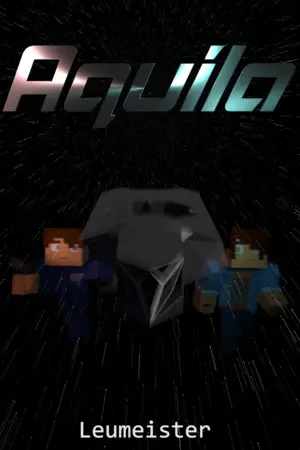
I have another question… Can you tell the character on the left is a right? It would be a bit more obvious when I have the final character models, but this is all I have for now.
-
This topic was modified 7 years, 3 months ago by
-
AuthorPosts


- You must be logged in to reply to this topic.